
I have written previously about how I take my architectural photography images, as well as other articles about being an architectural photographer.
In this article I will explain the entire editing process, from importing a set of images from an architectural photography shoot into Lightroom to preparing them for issue to the client. I will cover
- How I organise the images
- How I process one image
- What I do with the metadata before issuing images to the client, and also before outputting anywhere beyond my PC hard drive.
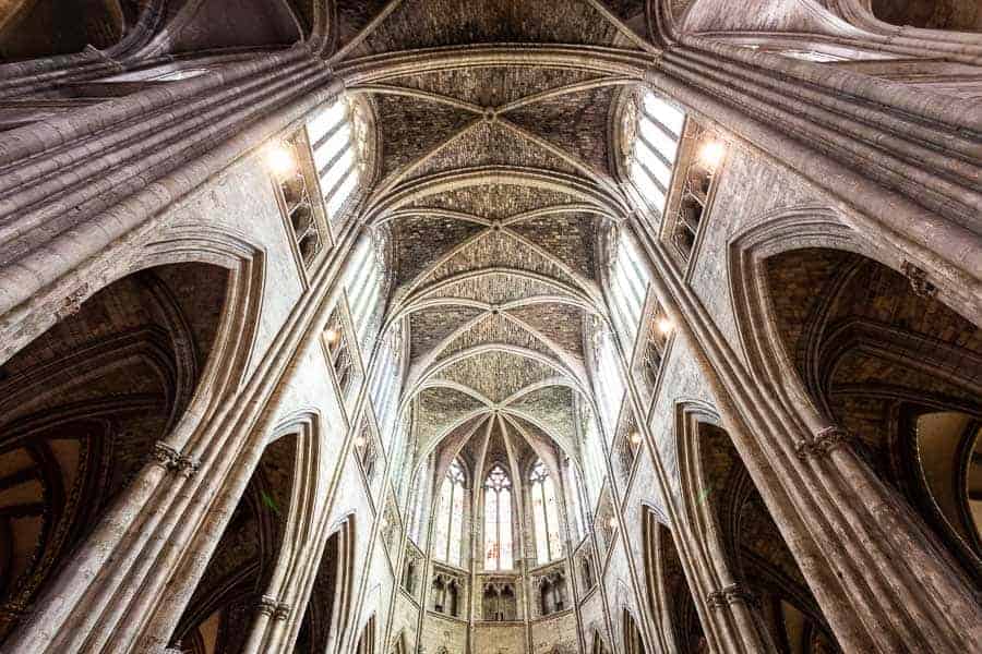
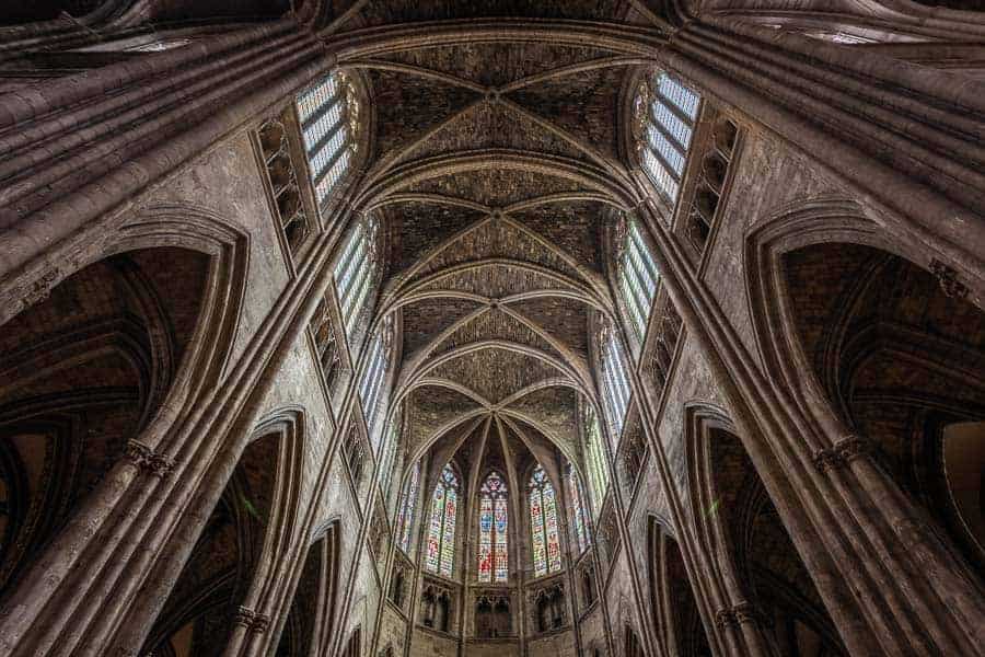
I am going to use a photograph taken in the spectacular Bordeaux Cathedral as my example, and explain my processing step by step.
These are the links to all my previous articles about architectural photography
Want to be an architectural photographer? Read my guide here
10 Tips on getting work as an architectural photographer
10 tips for planning an architectural photography shoot
What gear do I use for my architectural photography? Find out here
How I take my architectural photography images – a detailed explanation
19 things for a client to do before you photograph their house
Before I go on, I am a Windows user based in the UK, and all my processing work is done in Lightroom and Photoshop.
Importing into Lightroom
All my images are imported into a single Lightroom Catalogue.
Metadata import presets
I add copyright info to every image automatically on import
Develop import presets
When I import images into Lightroom I automatically apply develop adjustments, which are in a preset.
Why do I do this? I have found over time that I make adjustments such as these all the time, so why not make a start and get them done automatically by Lightroom?
It also gets my processing going and gives me a great idea of where the processing of image is going. And it also applies a consistent set of initial adjustments to each and every image. Sometimes I do not have to do too much further work, and if I needed to get a draft edit of an image issued quickly I can use the image with the preset adjustments only.
It just saves time and gets me going.
The develop settings I apply using an import preset are as follows
- Contrast +25
- Highlights -25
- Shadows +25
- Clarity +25
- Vibrance +15
- Vignette -10
- Detail (sharpening) – see below
I also apply a profile preset to images on import – this is a new feature introduced in Lightroom Classic 7.3. I use Adobe Colour. Landscape is too strong for architectural work.
Sorting the images
There are typically 300 – 1000 images from a shoot. First job is to sort them.
Once the images are in Lightroom I add them to a folder within my commercial photography main folder. I sort the folders by year, client and location. Within the job folder I create sub-folders called
- All
- Picks
- Picks not edited (sometimes the edit does not work)
I move the images to the folder called All.
That is all I need to do to sort my commercial images.
Sorting the bracketed sets
As I take three images using auto-bracketing I need to put these together in stacks. I add the three bracketed images from a single image capture into a single stack.
There is a cool way of doing this in Lightroom, which does this job quickly for me.
Auto Stack by Capture Time
Firstly I select all the images, using the keyboard shortcut Control A.
Next I right click within the highlighted images, select Stacking, and then Auto Stack by Capture Time. The default time is 2 seconds – any images taken within two seconds of each other are put into a single stack. I use the default 2 seconds as this works for me most of the time.
Next thing is to right click again, select stacking again, and this time select Collapse all stacks. I should have sets of three images now, with the correctly exposed image visible (at the top of a stack of three images). If I took 150 images, before collapsing the stacks I would have been looking at 450 images, after collapsing the stacks I now have 150 images on view– 150 sets of three images.
This makes it easier to select the images I want to process
Choosing the good stuff
Now I need to choose the images to edit. I use the short-cut E, which brings up the loupe view, then go through the images one by one. To select an image to work on, all I do is hit P for Pick. I do this with all the images. Once done I select all the picks using the filter tool and add these to the folder called Picks.
This is my first pass at selecting images. I select all the images in the pick folder, and then hit U to unpick all the images, and clear the pick flags.
Now I go through the images in a bit more detail. If there are multiple images from the same viewpoint I look at these all together. To do this I select all the images, then hit the letter N. This selects the survey mode.
This brings up all the images that I have selected.
By the way, to get rid of the panels to all four sides just use the short-cut Ctrl Tab.
Back to survey mode
I use control and left click of the mouse to remove an image from survey view. Once I have a selection I am happy with I use the Pick flag again, then move onto the next group of images.
I do this until I have the selection of images that I am going to edit.
Anything that does not have a pick flag is moved to the All folder.
I only edit images which I think I am going to issue to the client.
Rejects
Rejects and unwanted duplicates are dealt with in the first and second passes – I just hit the X key to reject an image. Once done I select all the rejects using the filter and delete the images completely.
This can be a quick process, or it can take a while – it just depends.
Now it is time to edit.
What the RAW files look like
These are the three RAW files stripped of all processing with the exception of the addition of 25 in the detail panel. The first image is the correctly exposed image, the second two stops underexposed, and the third two stops over exposed.
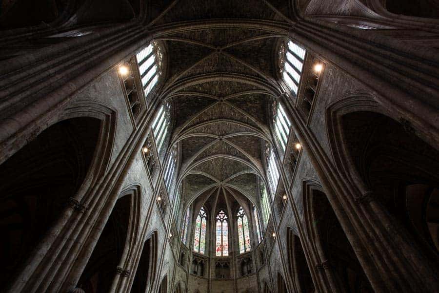
It is quite incredible how dull, flat and uninteresting a RAW file is, and even more amazing what Lightroom can do to such files.
Processing in Lightroom
The first question is this – what do I want to get out of my processing of the image? What is my end goal?
This is quite simple.
I want the image to look the best it can, whilst looking as realistic as possible.
My image processing is all about bringing out the depths of colours, tones, highlights shadows and details within an image.
I want to recreate the scene that I saw when I was there.
I guess this is why I don’t do much in Photoshop – I don’t feel the need to – Lightroom does most of the stuff I want really.
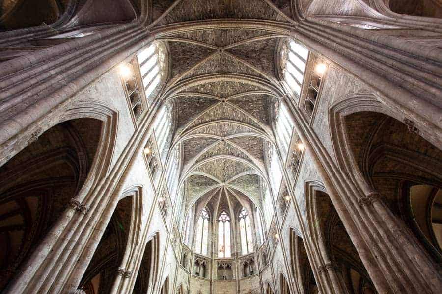
Before I go on, these are the two images with the develop presets added. These are the images I am going to be working with.

Creating the HDR file
First job is to merge the images into one single HDR file. I do this by selecting the two stop under exposed and two stop over exposed images. There is no point adding the first image – it just does not make any difference.
Once the images are selected I use the keyboard shortcut Control H, which opens the HDR Merge dialogue box.
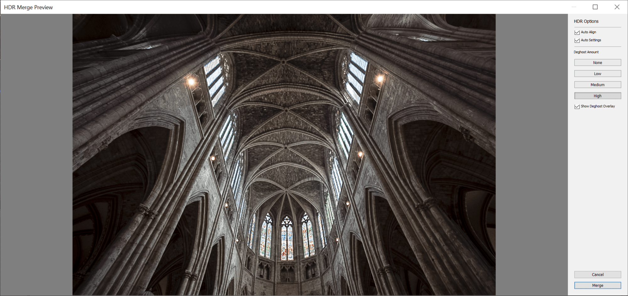
I use the settings as they are in this dialogue box
Here is the new file, a brand new RAW file. It is worth mentioning here that the two files used have not been altered – Lightroom creates a brand new RAW file.
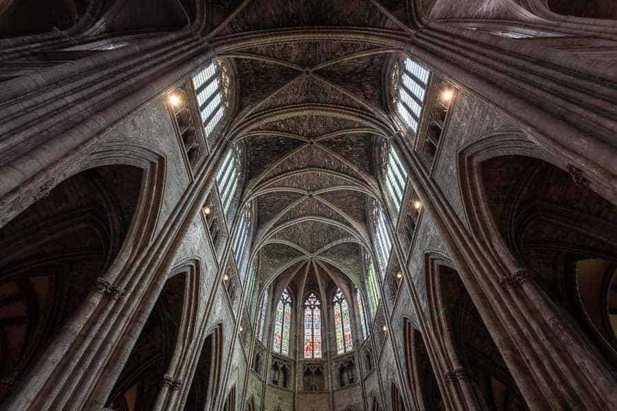
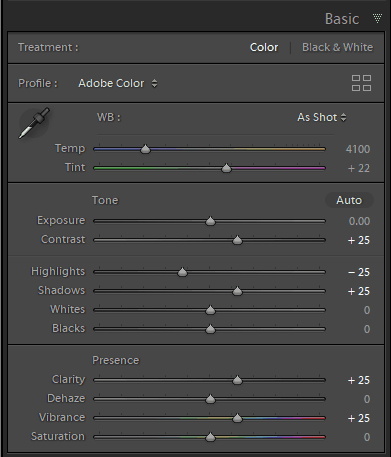
For this image these are the adjustments that I have applied.
Basic panel
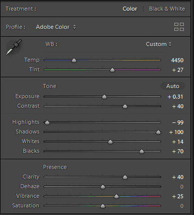
White balance
For this picture, as there was mixed lighting, I tried the White Balance presets but none of them worked. I went with auto, and then tweaked the sliders, making this a visual processing decision.
Important point here – calibrate your monitor, especially if you are a Windows user like me.
The other adjustments in this panel were also entirely visual.
I don’t worry about the numbers, just what I am looking at on the screen.
Tone curve panel
I never use this panel
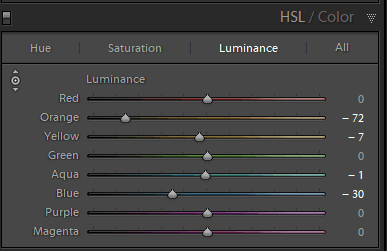
HSL
My favourite panel
First thing is to reduce the glow of those lights. To do this I select luminance, by clicking on the text, and next I hit the circle with the arrows to the left of the word luminance, which is the targeted adjustment tool. Once selected I can move my mouse over the lights, then drag down to reduce the luminance of just this colour, orange.
I did the same with the blue slider to darken the blue sky that you can see through the window.
I want to make the most of all the colours in a scene.
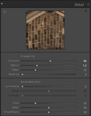
Detail
These are the setting applied on import. This does for me.
Transform
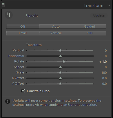
I use the crop and transform tools together, going fro one to the other. For this image all I needed to do was the roatation you can see on the screen, then make sure the centre of the image was exactly in the centre, by cropping and dragging the centre of the image to the middle.
When I am using these adjustments, I highlight the effect then use the left and right arrow keys rather than dragging the sliders – this is much more precise.
You can do this with any of the sliders in Lightroom by the way.
One thing to say here – when in the crop tool I use the grid, which you can get to by selecting the o key until you get this view.

This is absolutely vital to help me get things right in both the crop and transform tools.
Effects
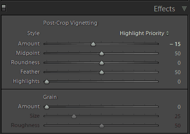
I love a vignette. The purpose of the vignette is to darken the edges and lead your eyes into the photo. This is an old technique from back in the days of the darkroom, which I use on every image. As you will see it is just one slider, that I only ever slide to the left.
Processing in Photoshop
I don’t do a great deal of work to images in Photoshop. The main thing that I to do is remove sensor dust spots caused by my shoddy cleaning regime. (To be honest I am scared of cleaning my sensor after a bad previous experience so get it done as and when I am in the vicinity of a Canon engineer – I find once or twice a year does me!)
Apart from removing the defects I have caused I also remove anything that I do not want in an image. I don’t have a problem with doing this as this is not editorial work, and I make no secret of this fact.
I am particularly keen on removing things that spoil the edges of an image – if something is cut in half by my composition I either crop it out or remove it.
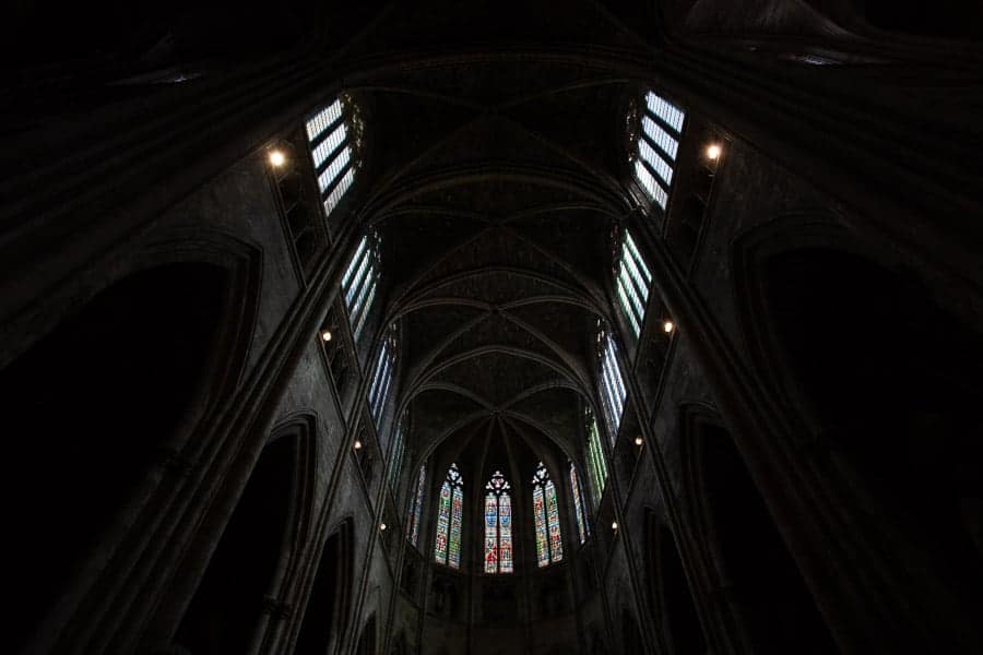
Back to this picture of the stunning Bordeaux Cathedral.
I don’t like those lights. Let’s get rid of them.
Before doing that I went back to the HSL panel and reduced the Orange to -100. If I am going to get rid of the lights I need to get rid of the effect that they produce as well.
I removed the smaller lights using the Spot Healing Brush Tool. The larger lights I removed using the Clone Stamp Tool. Now I am sure there are some people who are more knowledgeable than me in Photoshop who will tell me of some spectacular way of removing these lights with one click – if so please do let me know.
The Clone Stamp Tool might be time consuming, especially on things like this, but it does the job for me.
I had to remove the glow caused by the lights on the stonework and in the reveals. Now I am not claiming that this Photoshop work is perfect, but when I zoom back to view the image on my monitor I can’t really see what I have removed.
It is more important that time and care is taken to look beyond the immediate area being worked on to make sure everything around makes sense.
All I do now is save the image and it appears back in Lightroom right next to the image I sent there.
That is Photoshop done.
Apart from one thing that I need to point out.
I don’t use layers. I don’t need layers. If all you are doing in Photoshop is removing stuff like this then don’t worry about layers. I have the version that was sent to Photoshop in Lightroom, and a new version with all the stuff removed so let’s keep it simple eh?
Here are the before and after images.
Metadata
If I was starting again with my photography I like to think that I would add metadata to images on import. But I didn’t. So I have tens of thousands of images with no metadata at all.
And do I care? Not really.
As long as things are sat on my hard drive they do not need keywords. It is only when images are released to the world outside of my office that metadata becomes relevant.
I add the following metadata to every image issued to a client. And I really mean every image. And I try to do the same to every image that I put on my website or send anywhere on the word wide web.
- Keywords – all the keywords that would help describe the image to Google.
- Filename – I rename the files to include the location, one keyword and my business name.
- Title – As with the keywords, a written description of the image with the information in the filename and title plus more words.
- Caption – More text adding to the title field
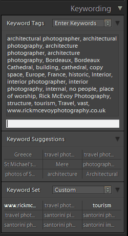
Here are the keywords for this image
What do I issue to my client
I issue a full set of fully edited high-resolution Jpeg files.
I also issue a set of low resolution images, using this export preset in Lightroom.
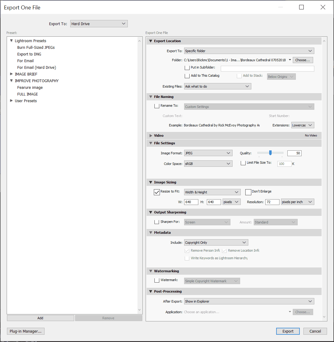
These are for the client to email or share quickly – the file sizes are incredibly compressed.
And that is that.
I make sure that I have deleted all the rejects, and that all the images are correctly filed, and then I move on to the next job.
Some other things to remember
Monitor calibration
I use a Windows PC, so have to calibrate my monitor. I use a 32” 2K BenQ monitor, and use this to calibrate the monitor. I do this every fortnight, when the I Rite software reminds me to!
PC Memory
I have just upgraded the RAM on my PC to 16 Gb from 8 GB. This has given me a significant improvement in the speed of image processing in Lightroom – such a significant improvement that the £140 it cost me has paid for itself over and over.
Summary
I hope that you have found this helpful – thank you for reading all the way to this point, and please add any questions or comments in the comment box. I look forward to hearing back from you good folks, and endeavour to answer all comments and questions.
Wow. Learned a lot here. Thxs Kim
Hi Kim
Thank you very much for taking the time to commment, and I am glad you found my article of value.
With regards from ENgland
Rick
Awesome post. It really gives a clear idea about the topic. I will definitely follow the instruction. Thanks for sharing.
SEO Training in chennai
Hi and thank you for your comments.
With regards from England
Rick
Aren’t Import presets unnecessary here? Lightroom ignores any pre-processing of images used for HDR.
Hi Tony
Thanks for your comment. If you turn off Auto Settings then Clarity stays the same but other things do not.
Other things such as the profile and lens corrections are still applied.
Personally I like the auto adjust, but hate the fact it reduces the contrast. It just depends on the images and the lighting.
Regards
Rick
Nice information shared. Thanks of sharing it.
Hi Nagesh
Thanks very much for your kind words – I am really glad you enjoyed my article.
With regards from England
Rick
Are there any moral considerations among the photographers when using photoshop or Lightroom? If so, Is there any line that should not be crossed while editing a photograph?
Hi Zubida and thank you for your question.
With my architectural work I have to produce technically and factually correct images, so this is not an issue.
I don’t think there is a line as long as people are honest about the extent of editing done to a photograph, and comply with the rules and guidelines of the environment they are working in.
With warm regards from England
Rick
A lot of very good workflow information here!
But I’m rather baffled: are you really suggesting to shoot HDR in architectural photography? Or do you mean real estate?
Hi Jed
Thank you for your comment. I shoot all my architectural photography images using HDR. I do not do real estate photography any more.
With regards from England
Rick
Then, as I said, I’m quite surprised that this is the advice you give, as HDR in architectural photography is hardly accepted. It would be an equivalent of not having your verticals vertical, just something not keeping with (unwritten, admittedly) industry standards.
Check some best architectural photographers, or – to look from the other end – world-leading architectural practices. You will struggle to find an HDR image.
Hi Jed
Thank you for your further comment.
Who says it is not accepted? I have never heard that said.
HDR is just getting a broader exposure – under exposing by a stop is accepted, as is over exposing by a stop. And if you use both together this is fine?
It is no different to taking five different exposures and selecting bits of each Photoshop which is a common practise.
If HDR is done properly you cant even tell. We are not talking the over processed grungy looks of the past here.
With regards from England
Rick
It’s the same as with the vertical verticals: it’s not an ‘official’ rule, yet it exists. Go to ArchDaily and try to find an HDR image. Or, as I said, try from the other end: go to the website of any world-leading architects and try to find an HDR image.
HDR produces very flat, unrealistic and unnatural results, and this is not what architects look for. Just look at your image above: there are sections of the image which are actually brighter than the windows! This picture is actually better before postprocessing. By trying to get rid of shadows HDR technique defies the very nature of gothic as architectural style.
Suggesting HDR is a very misguided advice to be giving in this field.
Hi Jed
You are entitled to your opinion, and I am entitled to mine. Lets just agree to disagree?
With regards from England
Rick
W
Hi Rick, I was trying to reply to your comment but can’t with my usual email address. Did you actually block me?
hello for the same. Thank you so much
Hi Rick, I am using Lightroom from about 3 years and I never touched before this circle with the arrows in HSL panel.
After reading your article I checked how it works and find it wonderful. Thank you! Have a good day.
Happy new year 2019. Dmitriy Christov , beguiner architectural photographer from Belguim.