
So you already know that the rule of thirds, leading lines, and framing your photo are some of the basic photography composition techniques photographers commonly use. Here are a few other not so common composition techniques that can set your photos apart from the rest!

Left to Right
Put the focus point of your subject more to the right side rather than the left. Our eyes are used to reading text left to right, just like you are reading this article, so follow the same idea in your photos. No, this is not the rule of thirds or leading lines; rather, it draws your viewer's eye in to the photo.
Try this little exercise to see what I mean: Take one of your photos that has the focus point on the left and use some photo editing software to flip it over. See any difference? In the photo with the left focus point, you look at the subject and then quit looking. But in the one with the right focus point, you automatically look across the entire photo. Same photo, different result.
Obviously you wouldn't want to apply this rule blindly, but in some situations I have found it to make the composition just slightly more interesting.

Tell a Story
A picture is worth a thousand words, right? Think about that every time you take a shot. Does that sunset photo show a pretty sunset or does it show a feeling of calm and peace at the end of the day? What story are you trying to make people see and feel when they see your photo? Don’t forget to tell the story next time you press the shutter button.
Telling a story with your composition is nothing new. You have probably heard that before; however, one thing that I consistently see results from in my photography is paying more attention to what is excluded from the photo than what is included in the photo. The key to composition is to analyze every single thing in the photo, and then place it in a way that adds to the subject itself.
In the image above, there was a lake in front of the cabin that I thought should be part of the photo. I included it in the original photo taken on location, but once I got home and looked at the photos on the computer, I wonder if it's better cropped to only the top-right of the photo. Do you like the cropped version or the uncropped version?
Simplify Your Compositions
Keep the focus on the subject, not all the details in the scene. Too many details take the focus away from the story your photo is trying to tell and make it more difficult for the viewer to figure out what you are trying to convey. The building behind the family is not part of the family… so don’t put it in the photo (unless it has a great pattern, enhances the photo, or makes a good backdrop)!
Another way to bring focus to your subject is with light. The eye is naturally drawn to the brightest spot of a photo By using light, positioning, and depth-of-field to make the viewer pay closer attention to the subject, you will capture much more impactful photos.

Odd vs. Even
Odd numbers of things tend to be more visually exciting than even amounts. Because of this, triangles are more dynamic than squares (which often look like a frame). Three's the magic number rather than two or four. Choose seven over six or eight, and nine over ten… You get the idea.
This composition trick works really well when posing groups. Group photos have a tendency to include lines of people: front row, middle row, and then tall people in the back row. That makes for a very dull composition. If you group up the people into a triangle, you can have any even number of people and create a much more dynamic composition.
I recognize there are times that the old giant line photo may work best for very large groups, but when you have a small group, try the triangle composition for more interest.

Crop with Care
I don't go crazy about exactly where a crop on a person is “supposed” to be, but I do think it is important to crop with care. My rule of thumb is if you are going to crop off part of the body, crop hard. Cut off a good chunk. The real problem happens when you just barely cut off a skiff of the person's head or cut off half the hand, etc.
For example; if the photo is a full length shot of a man with no feet or just one foot, the man will look odd and the viewer's eye goes right to the missing feet rather than his eyes.
Again, don't be afraid to cut off part of the body, but remember to do so with care.
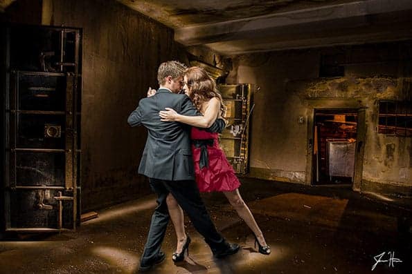
Break the rules!
Don’t be afraid to break the rules and try something new. There are times when breaking the rules is precisely what makes a photo stand out from all the rest.
Want to know even more about how you can get that epic composition in less time? Check out Jim's Block Method Composition Training!
You’ll get this kinda advice on any photography website. I implore you guys and girls out there who really wanna get more interesting photos, without having to over-cook the post-editing, to LEARN YOUR CAMERA! Get to grips with your shutter speed and how it affects motion in your photo. Learn how to creatively use ‘depth-of’field’ within a photo by controlling you cameras F-Stop. LEARN THE MECHANICS of photography and let your subjects find you!
Thanks jim have been an avid reader of your tips on various photography techniques. Thanks for inspiring and educating us in pursuing our passion for photography.
Not sure about the dancing couple, I would like to see it using different crops?
Jim, U r Simple! That’s why U r on d ‘Great way’…~~~ Simply U Hammer Simplicity is d BEST TRICK in LIFE & Photo~LIFE, as well.
Btw, The LEFT with Entire Allows U a more Soothing experience, sply. the Water body, @least to my Mood.
In d Dancing : If its Cropped, the irrelevant Background is eliminated and the Main character gets more SPACE & Enlarged as well with More Expressive Faces & Upper Torso 2 Claim Ur Eyes & Heart. Whats Ur take?
Love 2 B in d Pane….
The advice about placing the centre of interest on the right side third is a very useful one. I also feel that placing of the centre of interest depends a lot on how the virtual leading lines lead our eyes to the subject of interest.
Very nice tips! Took notes and will try to apply them when I can.
As for the last image… I don’t think you broke any rules of composition at all. It’s a great composition and I think it’s because of the leading lines coming from the four corners of the frame; Also balance: I noticed the subjects are off-center and leaning to the left of the frame because of the posture of the dancers (imagine being in that position) and the large door on the far left gives the left side of the frame heavy but is kept balanced by the low ‘door’ (I think it’s a door) on the right side of the frame.
Just my 2 cents.
Great article! I’ve noticed lately that I tend to shoot most of my portraits vertically and when I push myself to shoot horizontally it changes the whole composition and feel of the photo. Just another thing to think about. 🙂
This is very informative; i must admit i did not think about Composition in this way. i do disagree with “most people read left to right”, remember how many millions read in the opposite direction in Asia,the middle East. i would like to have a broader audience and relate to different people around the world and not just the West.
Hmm.. interesting post, though incorrect. Most of the world reads left to right. Its only the middle eastern languages like Arablic etc are read from right to left. Not a majority! Japanese is read top to bottom, not all of Asia.
So in other words, majority of people on earth read left to right!
Then again most those in other places who reads right to left, you mention, do not really care about these writings, posts or photographs! Never mind!
Hmm.. interesting post, though incorrect. Most of the world reads left to right. Its only the middle eastern languages like Arabic etc are read from right to left. Not a majority! Japanese is read top to bottom, not all of Asia.
So in other words, majority of people on earth read left to right!
Then again most those in other places who reads right to left, you mention, do not really care about these writings, posts or photographs! Never mind!
Agreed. Especially with photographic images.
Agreeing with Roberto Santiago Rodriguez. I want to have a broader audience. Maybe “most” of our world reads right to left, but billions do not.
Great information. Thanks very much!
The photo at the top of the page is just awesome, you mention about drawing ones attention from left to right as we generally read. However I also found the cloud formation drew me in to the house as well, don’t you think the clouds act as a big arrow?
Fantastic photo an d clearly taken by a professional, I am truly enjoying your site Jim and I found by chance (a Kim Roach video)
Awesome stuff you have found a new fan 🙂
I think the picture at the top of that house is unreal.
Look at the sky? In real life you will never see the sky so blue. I think post processing is over done. the picture will look much better with just normal blue sky.
@Jazz – I think you weren’t there to see the sky. I was. It was incredible in real life! Actually, I don’t think the picture does it justice.
I would disagree that the bottom photo breaks “all the rules”. In fact, I don’t think it breaks any rules.
Firstly, the centre of mass of the couple is to the left of centre, they are not dead centre (unless you account for the trailing leg – which doesn’t occupy much space). If you cropped the right of the photo to make the couple dead centre, then it would look wrong (I tried it). Also, the door on the left add balance, as it takes up space, making the couple appear somewhat more to the left of centre than they really are.
What other rules does the photo break? The couple are in the light, whereas the rest of the photo is in the shadows. The are some leading lines with the ceiling and the wall. The couple have space to breathe and there is a sense of depth.
I don’t mean to be critical, the post is very useful. However, I don’t think this is an example of a photo breaking all the rules.
Really helpful points. I’m also agree with first point left to right. in example right image of two is more beautiful.
Thanks and keep sharing.
These are advanced tips? Really? I would hate to see what the basic tips look like. All of these tips have literally nothing to do with design a.k.a. composition. I also find it amusing that at the end of every article on composition on the internet suggests breaking the rules. Why? Because the photographer doesn’t know the rules to begin with. This suggestion is repeated so much that it’s become a cliche.
Thanks for the information, I liked the Triangle in the portrait of four people, First time I’ve seen that. Also cropping heavy on the hat. I’ve seen cropping diagrams before, but the crop at the top of the head in that diagram, didn’t include a hat. Thank you.