
Color correction – accurate color within your photos is something that can separate the amateurs from the pros and can even separate some of the pros into separate categories. Generally speaking (and I’m speaking very generally), the distinction to “true” color correction begins to happen at the commercial and fine artist level. For the sake of this article, I am going to assume you know how to use the white balance tool in Lightroom or Camera Raw to achieve a starting balance for your images.
Within commercial photography, one is generally expected to meet certain criteria when it comes to color. For example, a particular brand may have a certain degree of “red” that must be met. Accurate color correction will see that final image with the correct shade of red – usually demonstrated by side by side comparisons.
Color correction in the digital age comes with a major struggle: images displayed on your computer or phone screen may look different between multiple devices. I’ll show some examples of how this affects correction later in the article. However, there are steps that can be taken to mitigate these issues in the pre-editing phase of working on your images.
Here we see a comparison of two images. Everything is the same – except that I color balanced them on two different monitors. This is the amount of difference calibrating your monitor can make.
Now, before we get into the nitty-gritty of color correction, it’s really important to realize that color is only as “true” or “accurate” as you want for your images. They are your images, and unless you’re hired to create images up to a certain standard of color correctness, how far you take any of these ideas – if you even decide to use them in the first place – is entirely up to you. I do highly recommend at least playing around with any of the techniques mentioned, though, so that you might grow comfortable with all that Photoshop has to offer.
Tip #1: Utilize gray cards
These things work wonders when you’re shooting in a more controlled situation, where you are in charge of the lighting or at least the subject. Taking a starting image with the gray card present gives you a target to select for you 18% gray location. If you aren’t familiar with 18% gray, that’s a topic for another day – just know that you are trying to give your image a gray target that can be used with your white balance tool in Photoshop/Lightrooom/ACR. You can also utilize larger cards/gray objects to calibrate your white balance in camera.
Here’s the thing. I frequently see articles talking about color correction end at the white balance discussion. But I’m going to be honest, simply setting a good white balance isn’t always a sure-fire way to get your image to be “color correct”. If you have mixed light sources (tungsten and fluorescent lights, for example) within the image, part of the image may have a color cast completely different from another area. It can get a little overwhelming! But, the gray cards are a wonderful first step to getting you where you want to be.
You can get a 12X12 gray card here from Amazon.
Tip #2: Calibrate your monitor!
I cannot describe to you how important this is. When you calibrate your monitor, you generally have options to set that calibration to a particular standard, whether aligning it to a printer model or corporate expectation or any number of other “real” color settings – depending on the type of color calibrator you purchase. What this means is the image you are working on is displayed in a way that is close to how you want the image to actually be perceived by others in its final form.
When I was younger and still learning, I did a whole series of shoots with friends as models. I edited them – I was so excited for them. And then when I looked at my images on my phone and other screens, everyone was golden! And not just a little glow-y, they were actually golden. My background, which should have been white or gray depending on the shoot, was also gold. It was so embarrassing! Calibrating your monitors helps avoid that kind of embarrassment.
In addition, if you work between multiple devices, calibrating them so they all are presenting color the same way becomes vital. Otherwise, you may make a change that looks good on one screen, and two days later load the image on a different monitor and realize everyone has a purple tone. I will sometimes bounce an image between different computers and both my wife’s phone and mine, just so I can visually inspect how the image looks across different screens.
A wonderful and fairly inexpensive color calibration system is this Datacolor Spyder5PRO from B&H
Tip #3: Work on color correcting in the morning
I’m not a morning person. In fact, I quite love being able to work on images until well into the night: midnight, one A.M., etc. However, a professor told me that our eyes are most energized and able to discern color differences in the morning. I hate to admit it, but she was right. My best color correction happens when I’m fresh and gearing up for the day. Late at night, your eyes tend to droop, you lose focus, maybe your eyes start to blur from struggling to stay open; night is generally not the most successful time to work on your art, from an eyes perspective.
Tip #4: Print your work!
This is kind of a running mantra here at Improve Photography. It holds especially true for color correction. The best way to assure that your images are being presented in the most intentioned manner with regards to color is to physically print your work and display it in lighting that you intend. One of the best ways to print work to save time and money is to print test strips: small slivers of your images that cover a range of contrast (try to aim for a true black and a true white) that you can visually inspect for color, brightness, contrast, and any other visible variables you may be concerned with for your image.
Printing takes time. Especially if you print using large format printers. There are loads of outsourcing options available to artists who are unable to print at home; in Chicago, for example, there is a print shop called Latitude that offers a variety of services including large format printing. Utilizing these outsourced options could help save time, and sometimes they will have color correction services available to help you out. Be wary, however, because when you ask someone else to color correct, they may not make the same decisions you would in regards to the final color of your image.
Tip #5: Four eyes are better than two – have a friend help you check your work
It is really good practice to develop a relationship with other photographers, especially those who have interests that are separate from yours. They will bring a level of constructive criticism and suggestions you couldn’t get any other way. That said, they also bring another set of eyes that can help you search your images for color issues. After you stare at an image for too long, sometimes across days, you no longer see what’s there but rather what you know you intend to be there. So walking away and taking a break, allowing someone else some time to look at the work to give you feedback, can be one of the best ways to step outside yourself and the limitations of your eyes or perhaps simply your practice level.
I’m not the best at color correction. My way of handling color casts is to do everything in my power to control every wave of light possible in my images. When I know what is causing the light and what the color temperature of that light is (via my strobes), I have a much easier time controlling casts. Unfortunately, that isn’t always possible. Projects, expectations, and interests tend to vary and run the gamut of lighting situations; I have a few friends to whom I go if I need help with correcting images.
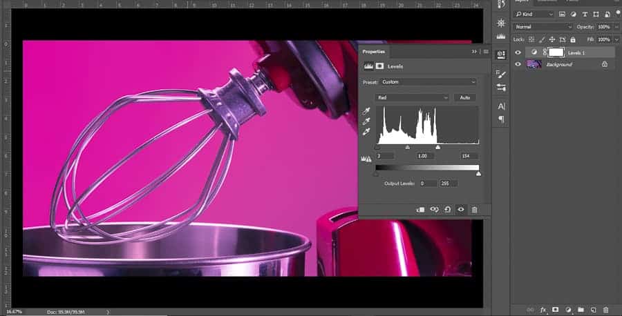
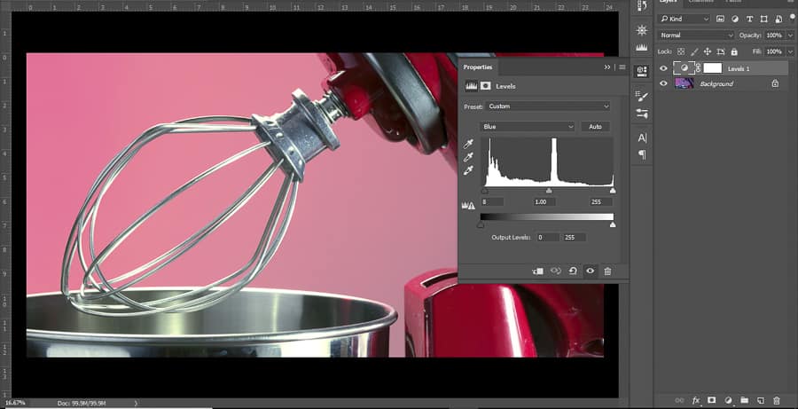
Tip #6: Remove color casts within the levels channel
Let’s assume that you don’t have access to Lightroom or Adobe Camera Raw. How do you rid an image of an unfortunate or unintended color cast? Well one of the best (and fastest) ways is to utilize a levels correction layer. This allows you to control the color, but also it enables you non-destructive editing – something of which I am a vocal advocate.
When you first load your levels layer, set your white point and black point by moving the left and right sliders in to the moments where your highlights and shadows start to climb (in the histogram). This may already improve your image as it frequently brightens the image and brightening an image can help eliminate those pesky color casts.
Once your white and black points have been set, drop down the channels box, and do the same process through your red, blue, and green channels. You should notice an immediate and marked neutralization of the colors in your picture. In fact, this correction may be the furthest you feel you need to go, since it’s setting your white balance in a similar way to using the white balance tool in ACR or Lightroom!

Tip #7: Utilize a curves correction layer to mask out individual problem spots
This is where the techniques start to get a little tricky. There is a great article on color theory that you can find here, written by Nathan St. Andre – I highly recommend checking it out! Color theory, however, is based in what is called “subtractive” color, as you add pigments on to each other the new color subtracts or absorbs additional wavelengths of light, causing the color to appear darker.
Light functions additively. As you add colored light together, you create color that is close and closer to white light. For quicker understanding: in subtractive color, the combination of all three primary colors results in black; in additive color, the combination of all three primary colors results in white. As if that is not confusing enough already, additive color has different primary colors (by one hue) than subtractive. Subtractive primary colors are red, yellow, and blue. Additive primary colors are red, GREEN, and blue (think “rgb monitors”).
Each of these primary colors then has a complement, which is where we get our CMYK color model from. C stands for Cyan, M for Magenta, Y for Yellow, and K stand for key, which isn’t important to the discussion at hand. RGB and CMY are listed in the order of their complements: Red to Cyan, Green to Magenta, Blue to Yellow. If you add red to an image you will remove cyan, if you add magenta you will remove green, etc. This is the basis for color correction with curves.
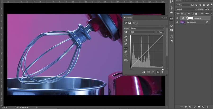
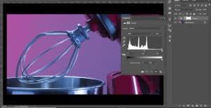
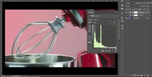
Let’s say you have an image that appears to be too blue (like the image above), even after you have equalized your levels adjustment. You add a curves adjustment layer, select the Blue channel, and then select a point along your curve and begin to drag (or keyboard arrow) down. This is lowering the blues in the image, which brings out the yellows. You can then continue to refine the image, so if doing so makes the image too magenta, you can switch to the green channel, drag the curve up a bit, and remove some of the magenta by adding green. All while maintaining non-destructive editing, allowing you to go back and continuously edit and refine your color corrections as you work on your image and gather feedback.

Tip #8: Refine the areas you are working in
Light is insane. It bounces all over the place; physics tells us it bounces in straight lines but I’ll be darned if I don’t believe that light has the ability to curve, dance, and get into all manner of crevices of an image where you don’t intend it to exist. Every time light bounces off something to illuminate another area, it is changing hue, based on the wavelengths the subtractive elements of your subject absorb (I know this is getting crazy confusing, but bear with me), resulting in smaller, less noticeable color casts.
However, you already know how to address these areas: curves adjustments! Since adjustment layers are not only non-destructive, but also mask-based, you have the ability to refine the area in which you are working so that if you have an image where reflected light or an unexpected light source is causing a small color cast you can correct the color using the curves layer, then mask just that area into the image.
It can be so easy to get lost in refining your image this way. It is not unlike artists spending hours refining the details of their current painting or drawing to such a degree that they could spend weeks working on the details of the image. Again, this is a process that you can take as far as you want until you are satisfied with the way that your image appears when it is printed or displayed on the screen of your choice.
Tip #9: Use curves to adjust the color casts – advanced
When you use curves, you are adjusting relative brightness of the color channels. If you pull the curve down, you are lowering the luminosity of that channel (the process is a bit more complicated, but this is the result of that action that we are most concerned with in this context). Because of that, if you have to pull down a particular channel, or multiple channels, too far to address a color issue, you may result in a darker image than you’d like.
To address this, you can use the opposing complements in order to make the same change. Back to our image with too much blue: instead of pulling down the blue channel to add yellow (which results in darkening the image – potentially further than desired), you can RAISE the red and green channels to around equal amounts to create the same color change, while simultaneously increasing the brightness of the image.
This technique is trickier because it requires a strong conceptual understanding of the additive color model, or at least patience as you work through exactly which channels to use when.
The opposite of this is if you have to add too much primary color back in to your image (if the image is too magenta, for example), you may create too bright of an image if you add the green in – so you can lower the red channel and the blue channel to as close to an equal amount as possible and you’ll achieve the same color change, while simultaneously decreasing the brightness of the image.
This is by far my favorite color correction process, but as someone who went to school for fine art, it was a huge part of every project I worked on. Practice makes perfect, especially in regards to color correction. Don’t be afraid of making mistakes.
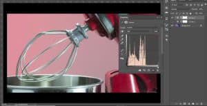
Similar color to the previous image, but much brighter. Again, curves are exaggerated in order to demonstrate effect.
Tip #10: Edit your photos in a dimly lit room
This tip is most effective if you have calibrated your monitor. Initial tendency with editing in general can be to crank up your brightness. After all, you want to make sure that you see EVERYTHING you’re working on. However, we’re working with light, and when you change the luminosity (brightness) of your image, even if it’s just the representation of it on the screen, it will alter how you interpret the individual hues of the image.
Some professional photographers will even purchase shields that can go around their computer screen, such as this shield for iMacs. This will keep your ambient light off your screen and block it from impacting your image – functioning in the same way as turning off overhead lights and/or keeping your room dimly lit.
Color accuracy is, in some instances, completely subjective. Embrace that subjectivity in your creativity, and don’t be afraid to break rules or expectations. However, learning how to accurately color correct any scene will only positively impact your understanding of light when shooting, and when editing creatively. Learning the “rules” only helps you better understand how to break them.
As one final note – if you are going to print your images, keep in mind that the lighting of the expected display location will also impact the way colors on the image are perceived. If you know what the lighting situation is going to be for your image, or if you have control of those environmental factors, look at your image under similar lighting so that you can be sure how it will look. There are also light boxes used for color correction that can be found and used if you want to be sure that the image is correct under “white” light – regardless of final resting place.
If you are a wedding or event photographer who needs to do deep color correction of about 1000 photos within a tight deadline, imagine, how many hours you will spend on editing these photos. To make it easier and faster, you may outsource your photo color correction to online photo editing services as FixThePhoto and receive professionally edited photos for about $0.20 per photo. You will get white balance adjustment, working over shadows, temperature, blacks & whites, adding specific style as matte/paste/vintage/film/monochrome, etc.
The biggest thing is: have fun. Push limits, test your curves layers and your masking abilities, see how far they can go. Make images look crazy and far out just so you can see and understand exactly how the individual color channels impact the images you’re working with. Don't just drag the curves line one direction – see what happens when you make an S curve on a color channel. Invert it! Get crazy! Finally, ask for constructive criticism, and plan to spend a lot of time refining these techniques (even the simpler ones).
What do you do to color correct, if you do anything? Drop a comment below and let us know what types of methods work for you and your workflow!
Hi there Michael, thanks a lot for your great ideas and suggestions on how to achieve real original color, longing to see more from you^^
Thank you for write this tips and its really very helpful for me. thank for playing klondike solitaire.
Con un po’ di studio sul metodo LAB e con tanta pratica si possono ottenere colori brillanti e molto più esatti che con altri spazi colore e anche molto più velocemente.Comunque articolo molto interessante grazie Graziano
Great advices.
I work with schools and I have to color correct a thousand different faces every day .
My biggest problems is Laminated Printing. Push way out the colors.
Thanks
Thanks for this impressive article here on our website you will play the spider solitaire game online on your pc tablet and on your smartphone without installing any applications and payment.