
Juxtaposition isn’t a concept that is often talked about among photographers, but it’s likely a technique you’ve been using in your photography without even knowing it. It’s a big word but an easy concept. Juxtaposition is just another term for contrast.
We’re already familiar with contrast in terms of contrasting light…shadows and highlights…whites and blacks. Unlike contrast of light, juxtaposition is the contrast of physical objects. It’s a visual contrast, where you have contrasting or even complementary objects within your image…composing your image with the intent of contrasting or comparing different objects in your composition.
It’s not just about putting multiple contrasting or complementing objects together. You need to tell a story and create interest through the objects you put together. To create juxtaposition, you need to have at least two objects or concepts in your image.
When using objects, each should also stand out on its own in your composition so that you’re drawn into each one, and are then able to recognize how the objects contrast against one another. When using concepts, you need to be clear on what each concept is. This can be a bit more difficult than objects, as the viewer would have to understand what each of the concepts are, and how they contrast with one another. An example could be a summer landscape being encroached on by storm clouds…a contrast of the dark dreary storm against a bright sunny summer scene.
Here are five examples of juxtaposition.
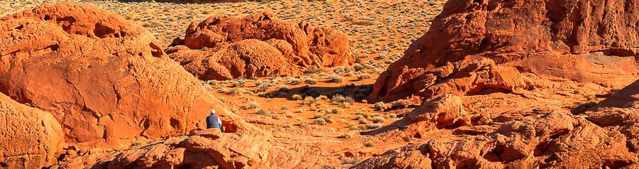
1. Juxtaposition of Scale
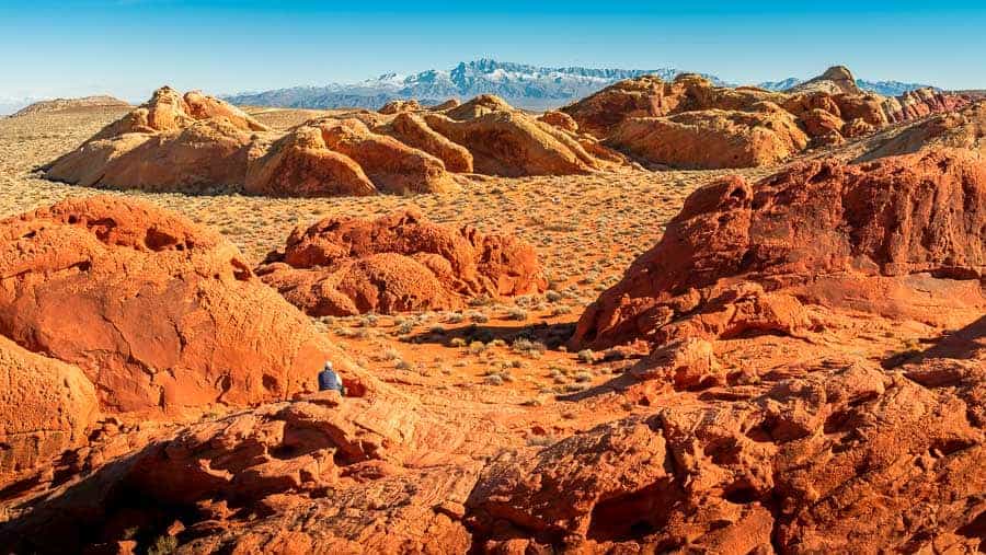
I took this image in Valley of Fire State Park a few years ago. After climbing up to the top of one of the rock hills to get a view of the distant landscape, this man comes along and sits on another of the rock hills in front of me. The juxtaposition here is the scale difference between people and vast landscapes…the size difference between the sitting man and mountain ranges he’s observing. Having the man in this image gives a better sense of the size of the hills and mountains.
2. Dark Colors with Light Colors
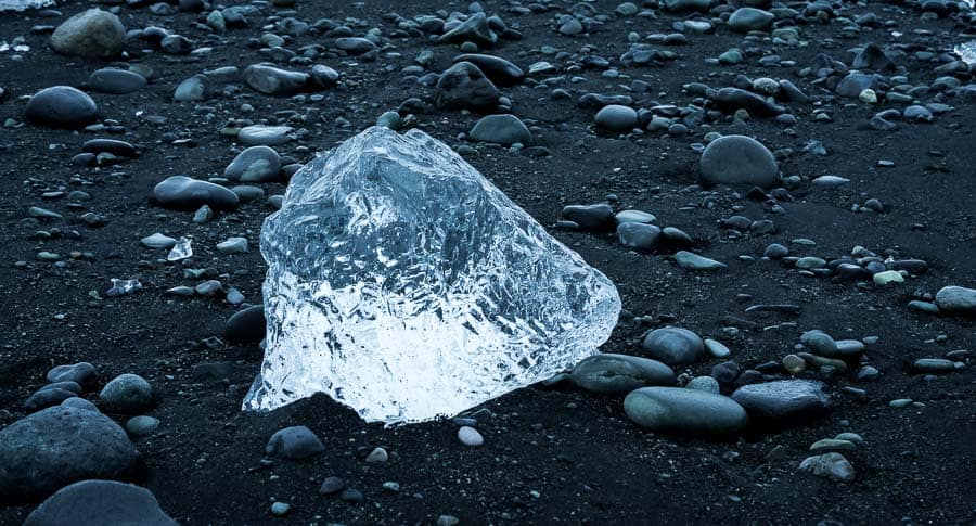
While it’s more conceptual, colors can be used to show contrast. We know dark colors and light colors create contrast, so why not use colors as the focal point of the contrasting image? I took this image last year at Ice Beach in eastern Iceland. I used the black sand beach to contrast against the brightness of the ice to really bring out the glow of the ice core.
3. Old and New
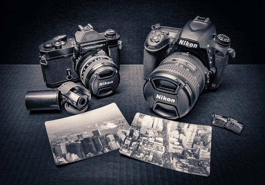
While doing some product photography, I decided to take this shot to position old and new with each other. This shot has my dad’s film camera, a mid-1970s Nikon which was also the first SLR I ever used while growing up, alongside my current Nikon DSLR…a generational image with two objects approximately 40 years apart in age.
4. Small and Large
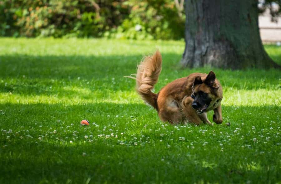
While hanging out at a local park downtown, I saw a lady playing with her dog, throwing a ball and having the dog chase and retrieve it. I wasn’t there being creepy camera guy; it was the morning of the Honda Indy, and I was there after parking the car before going in to watch and shoot the race from the grandstand. The juxtaposition here is the small ball and the large dog. Getting the image of the dog just before pouncing on the ball gives a complementary story of the two together.
5. Past and Present
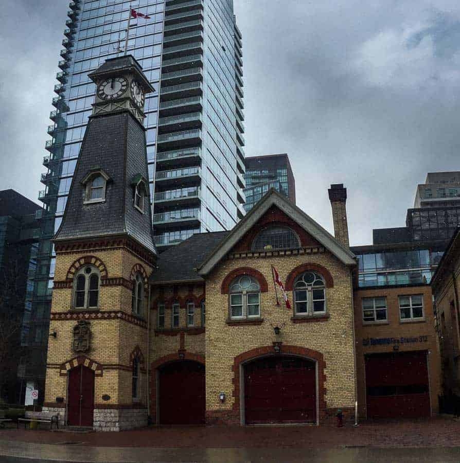
This spot is located around the corner from my office in the city downtown, so I walk by it quite often and got this shot back in the spring after a light rainstorm. The juxtaposition here is of the past and present…this old fire hall which dates back to 1878, against a modern day glass condo tower in the background.
How effective the juxtaposition is depends on how obvious you make the relationship. While some compositions can be staged, juxtapositions tend to be more interesting if they occur unexpectedly. This is not to say that you shouldn’t stage your compositions. When it works, it has the potential to raise your image to a new level of interest. Have you done any juxtaposition in your photos? Or have any interesting ideas? Let us know in the comments. Try to keep an eye out for it as you're out exploring. You may now be able to point it out a lot more, where you didn't really notice it before.
Juxtaposition is very well explained. Thanks for the article, Nathan. Keep writing more.
Thanks so much Vel…really appreciated!
Thanks for this impressive and knowledgeable article Here from our tutorial you will learn to create windows 10 recovery partition in easiest way without any help of technician.