
I ignored the constant advice to get a monitor calibrator as I do not print much and felt like I was getting okay results, knowing I needed to brighten up my images a bit after viewing them on my work computer. That all changed when I attended my first Improve Photography workshop a couple years back in Zion National Park. During one of the down times, we all gathered to compare images at the hotel and Jim put an image up from

everyone on the projector. I had an image I had just finished editing and thought it looked good. When Jim put it up the projector, I was immediately embarrassed. The image on the screen looked much different than the one on my computer. The shades of color were completely off and the red rock just looked unnatural. From that moment on, I started researching different options for calibrating my monitor. I have spend the better part of the last year testing three different options in preparation for this article. The three tools I tested are the Datacolor Spyder5, Colormunki Design and i1 Display Pro. After discussing the general use of each calibrating tool, I have sample images. I chose three images emphasizing different colors and compared their results on my computer and in print.
1. Datacolor Spyder5
The Spyder5 was the first calibrator that came to my mind as I had heard it recommended many times as a reliable option at a good price. The Spyder5 has a seven-detector color engine claimed to be enhanced such that it will provide improved tonal response at lower luminance levels resulting in more accurate shadow detail.
 I found the Spyder5 to be the easiest calibrator to set up and use. It was a very simple process. The hardware came with a link that led to downloadable software. Once I installed the software, it provided a very easy-to-follow set-up guide and I was soon calibrating my monitor. The actual calibration took under five minutes and the results were easily visible. I was pleased the display was not as dark as I had expected. My first impression was the overall color tone was much warmer than my original display. I viewed several images on another monitor and my calibrated monitor and I found the results on my calibrated monitor to be much better. My eyes quickly adjusted to the changes and I had no issues with my editing.
Overall, I was pretty happy with the results I got using the Spyder5. A few of my landscapes ended up darker and less crisp than I had expected, but usually the colors were very accurate and I was confident using it.
As of the time of this article, the Spyder5 was available for under $150 on Amazon.
2. Colormunki Design
Colormunki seems to be the favorite among many of the Improve Photography network and I have seen Jeff Harmon recommend it to many. I have to admit the Colormunki Design is going to be overkill for most photographers out 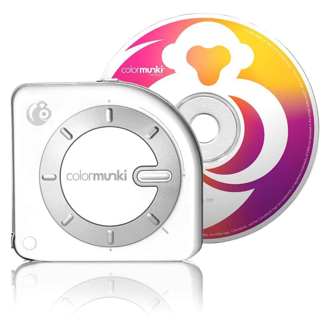 there as it is really for design professionals. That being said, there are other Colormunki models that are both cheaper and simpler that would be worth the look if you do not want all the extra features of the Colormunki Design.
To be honest, I struggled a bit with the set up of this calibrator. It came with a cd for installation, but my laptop does not have a cd drive. I used a separate computer to make a copy of the software and then tried to install it. Unfortunately, the software installation did not work. I got on the website and found what I thought was the correct software and downloaded it. Upon installation, I learned that it was outdated and I had to download and install an update. Overall, the download and installation process took a bit longer than I was anticipating. Once I got the software installed, I went to start using the program and I could not get the activation to work. Without activating the software, I was not able to use the calibrator. At this point, I reached out for help by contacting them through their website. To their credit, I received a very quick response that contained an updated version of the software and a patch to install. Upon installation, the activation worked seamlessly and I was able to start testing out the Colormunki Design.
The calibration was a bit more complex with this tool, but that is to be expected given the capability of all it does beyond just monitor calibration. In addition to calibrating your monitor, the Design gives you complete control over all your colors to ensure you can match every color perfectly. You can pull colors to match from the built in library or from any image, but my favorite capability was the ability to pull colors from any real life object. Basically, you can scan any object and it will load that color into your database. You can then ensure the color on your computer perfectly matches the real life color of anything you photograph. I cannot help but think of how valuable this would be to a product photographer, who could quickly and easily ensure their image of any product matches exactly in color to the real life item they photographed.
I was very pleased with the results I received using the Colormunki Design. The colors were very accurate and my prints matched my computer display very well.
As of the time of this article, the Colormunki Design was available on Amazon for around $500.
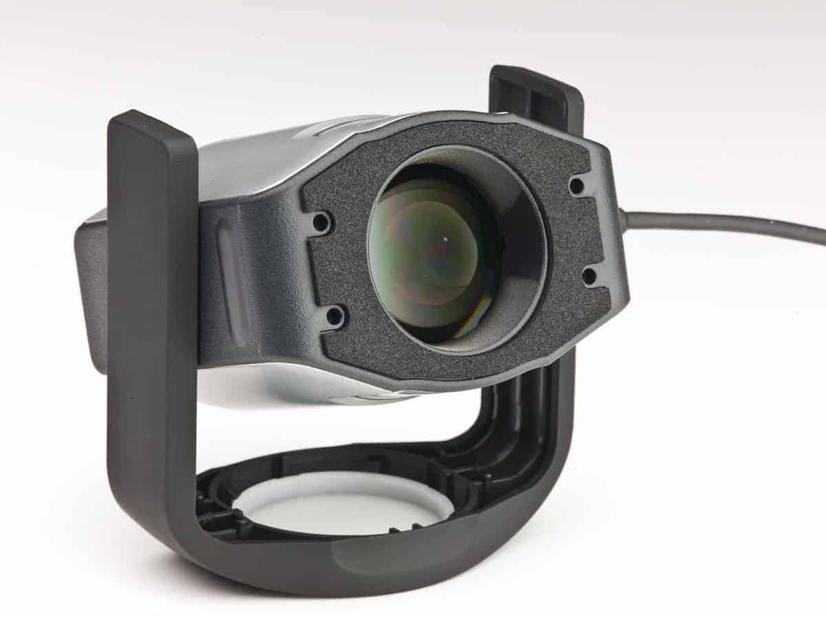
3. i1 Display Pro
The i1 Display Pro is made by the same company as the Colormunki Design. I found the Display Pro to be very easy to set up and use. The installation was quick and easy and the self-guided calibration process was completed within 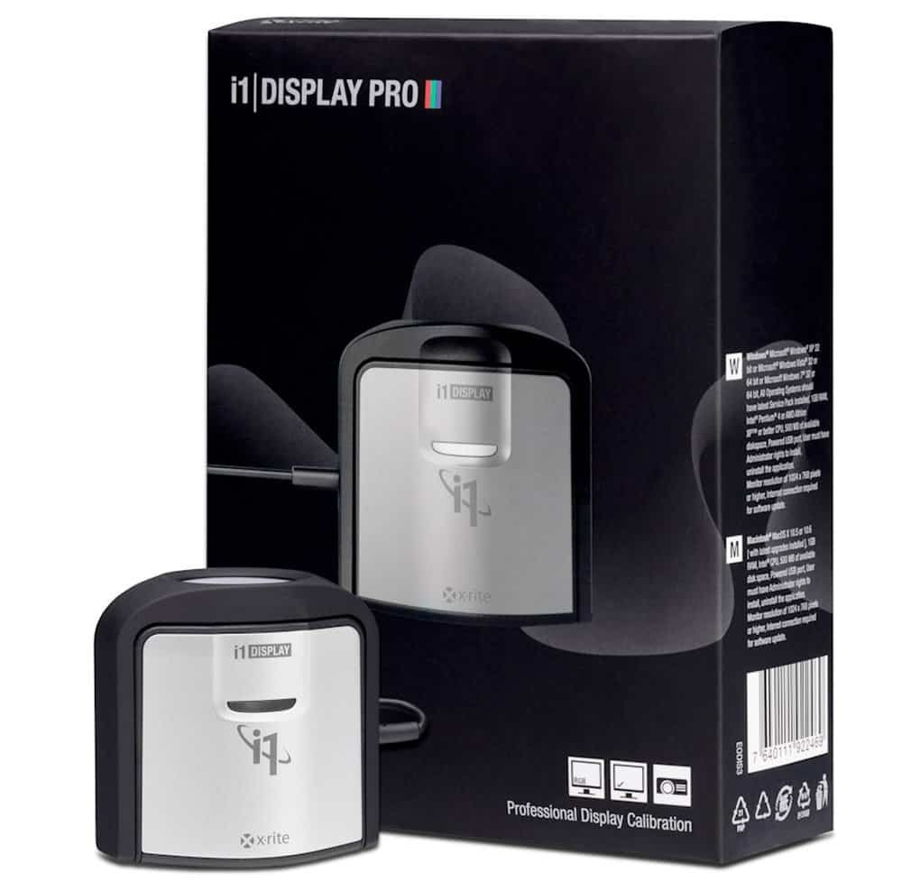 a matter of minutes. The Display Pro offers both a basic and advanced mode so you can choose whether you want to exercise more precise control or enjoy the ease of simple calibration. My favorite part about using the Display Pro is the simplicity in creating various profiles to match your editing locations. For example, I created profiles for when I am editing during the day with window light and for when I am editing at night with overhead light. Those two profiles cover about 90% of my editing time, but offer completely different ambient light settings. Now I can quickly switch between the profiles depending on when I happen to be editing images. The Display Pro is especially designed for this convenience as it has specific tools that can be employed to measure the ambient light and even warn you when the ambient light has changed.
 I was very happy with the results I obtained using the Display Pro. I felt the colors were accurate and the prints I received matched very well with with my computer display except for a couple occasions where the colors of the print appeared to be a little washed out, but overall the results were very very good.
As of the time of this article, the i1 Display Pro was available on Amazon for around $200.
SAMPLE RESULTS
I thought testing calibrators would be easy until I started thinking through the process. Of course I can calibrate my screen and then print and compare. That is great for me determining myself what I think, but it does not lend well to me sharing the test images. First, your screens are not going to be calibrated the same as mine so the results aren't going to look the same for you. Second, the only way I can share copies of the prints is to photograph or scan those. That lends to a host of issues such as the lighting when I make the image, my camera settings and then how I process the image. If I just convert the raw to a jpg, it is going to be flatter than the actual print. If I start making corrections to compensate for that, the result is not going to match the print and won't be reflective of the actual 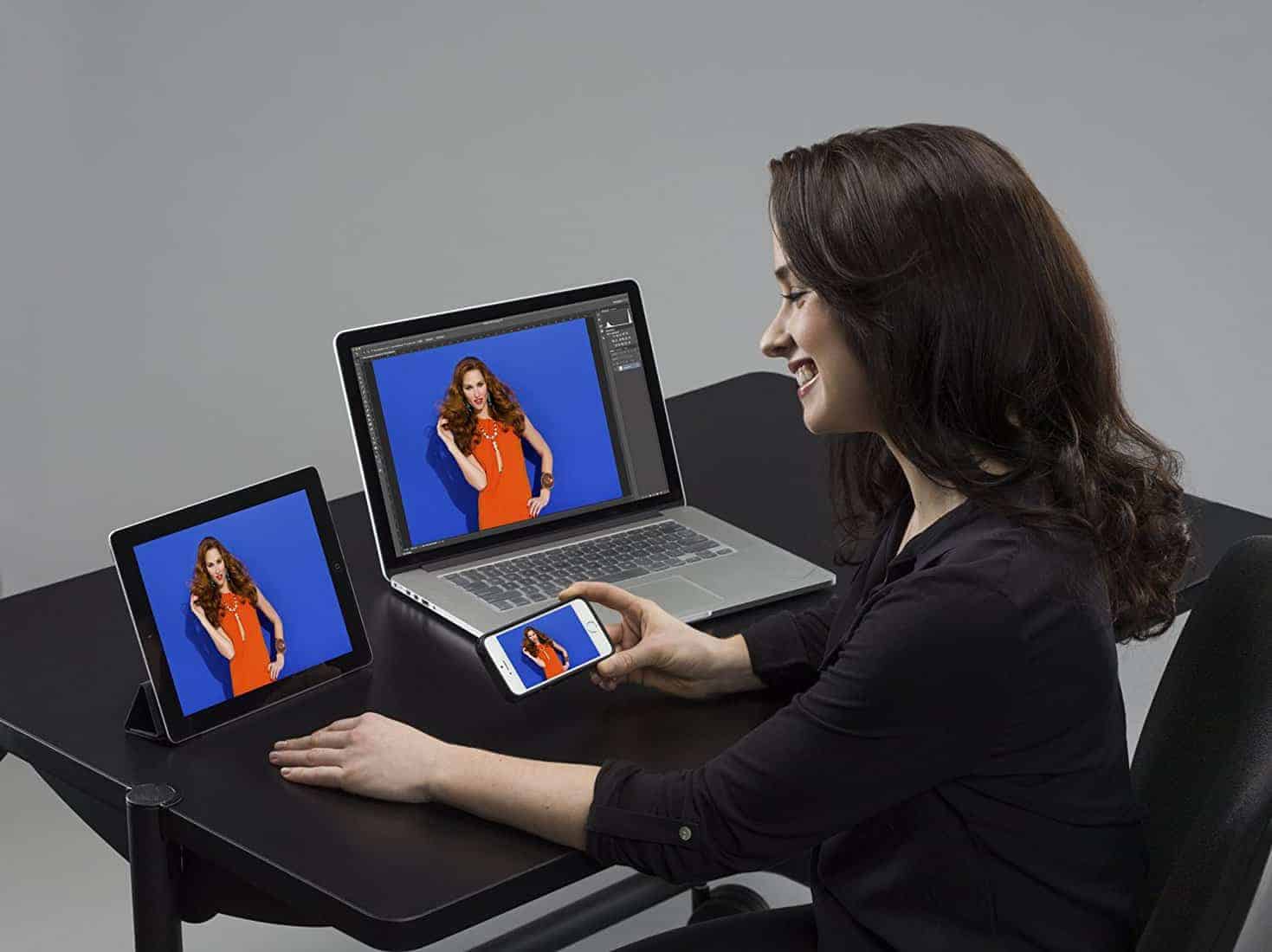 results.
So, with all that, I decided to select three images with different colors and tones. I Edited each of those without calibration. I printed a copy of those images. Then, I edited each of those three images with each of the calibrators and printed those as well. I printed at Bay Photo and chose the option where they do not adjust the image at all as that would obviously ruin the testing. I tried scanning in the photos to share the results, but the resulting jpgs looked nothing like the actual prints so I decided to just share the computer files below of each one and give you my analysis for how each print actually compares in real life.
The first set of images is a quick shot I had someone (not a photographer) take with my camera while we were having family photos taken last year. I thought this would be a good chance to test out the reds and greens. Starting in the top left and going clockwise, the images are no calibration (top left), Sypder5 (top right), i1 Display Pro (bottom right) and Colormunki Design (bottom left). I used the same placement in organizing all sets of images so I won't restate it for each one.
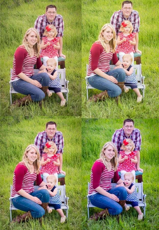
The uncalibrated image was actually closer than I anticipated, but the print actually ended up brighter and more washed out. The Spyder5 print also came out very close. The print was actually a little darker, but the colors were very crisp and I liked the result. The i1 Display Pro print was almost spot on. The reds were a little darker on the print, but very crisp. Finally, the Colormunki print was also near perfect, with the greens being just a little brighter on the print.
The next set of images is a sunset over canola fields in the Palouse. I thought this would be a good chance to compare yellows and oranges with a high dynamic range.
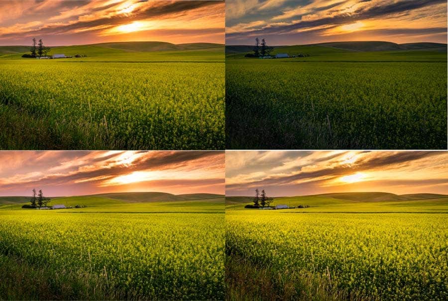
The uncalibrated print in this set came out very different from the image on my computer. The whole image was quite a bit darker, especially the yellow flowers, and the tones in the sunset were completely different. The Sypder5 print was pretty close, but the sunset had less blue and more pink in the print and the yellows were brighter. The print actually came out looking a lot nicer than the image on my computer in my opinion. The i1 Display Pro print was maybe one shade brighter, but otherwise a perfect match. Finally, the Colormunki print was also pretty much a perfect match.
The next set of images is an image of aspen trees in Glacier National Park taken during the free Improve Photography Retreat last fall. It was a good chance to test yellows and blues.
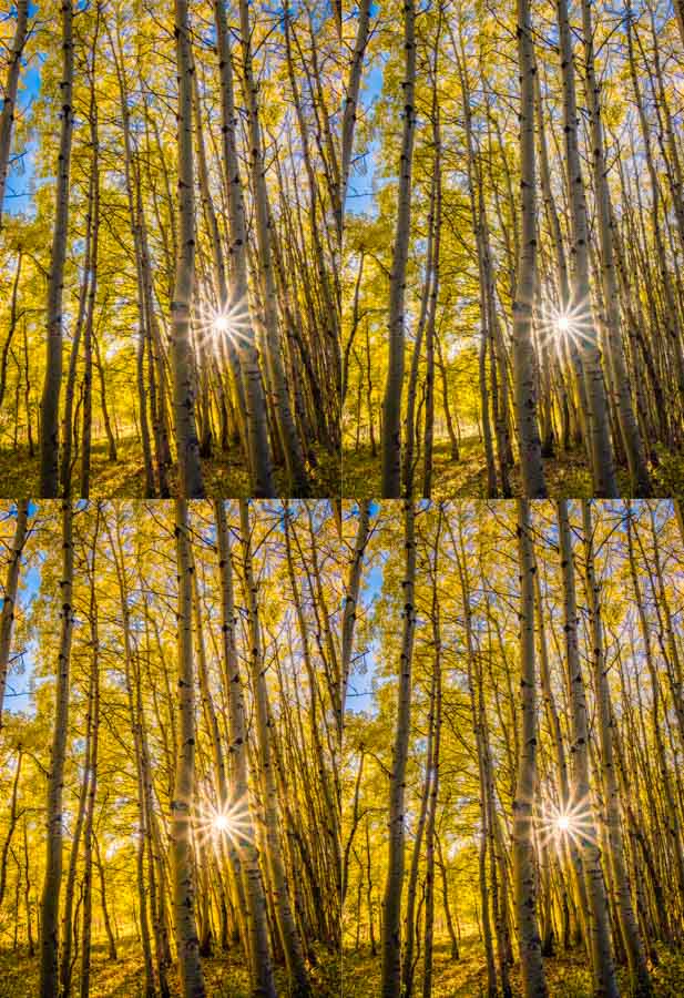
The uncalibrated print actually came out very close except for being a bit darker. The Spyder5 print was just one shade darker, but had crisper colors and was very accurate. The i1 Display Pro print was pretty much spot on, but maybe one shade brighter. The Colormunki print was very close, with the yellows being just a shade darker and the blues being a shade brighter.
Overall, I was very pleased with the results of each calibrator as the prints were much more accurate than the uncalibrated prints. Each of these calibrators are great tools and would appeal to a different consumer. The Spyder5 will be great for someone on a budget, but who still wants great results. The Colormunki Design is going to be for someone involved in more design work or product photography. Finally, the i1 Display Pro is a good option for someone willing to invest a little bit more, but who wants more options to get great results.
I bought my Spyder5 a couple of years ago and I’m going through all my digital aviation shots from the last 12 years and all my scanned photos back to ’78 to restore acurate colour – or at least as close as I can get. I’ve found that having used the Windows colour calibration facility as well as I could, it still doesn’t come anywhere near the results I achieve with the Spyder5.
Thanks for the insight Ray. Glad you are getting good results. I am kicking myself for putting it off so long because it really is so simple.
excellent post. I’ve been wondering for a few months if I needed to buy a calibrator and if so which one.
Thanks.
Thanks Antoine. I hope you found it helpful in your decision.
I use the i1 Display Pro and have been very happy and it made a huge difference between my display and my actual prints from my pro 10.
For me the color checker passport has made a huge difference in color management as well, it would be nice to see an article on that as well!
This is probably overkill for many people, but it’s worth noting Datacolor has a promotion on the Spyder5Elite+ right now.
https://info.datacolor.com/acton/media/5553/switch-to-spyder5eliteplus?utm_source=SLR+Lounge&utm_campaign=NSA-US-IMS-Online-Demand-Gen-Crossgrade-Promo-SLR-Editorial-Article&utm_medium=Online+Demand+Gen
Can all 3 be used in conjunction with each other?
My studio photographs hundreds of products a day and uses the i1 Display….great results, well worth the price if you do any printing.
Thanks for this article, it was exactly what I needed to decide which device to purchase! I went with the Display Pro by the way. 🙂 Cheers!
Thanks Chris! That one has definitely become my favorite over the past year.