
Adobe’s Photoshop is a very powerful tool where the only limits of the application are basically your imagination and vision. If it is a visual thought that you have created in your brain, with the right tools and techniques, you can make that vision a reality. The raw power and flexibility make Photoshop an irreplaceable tool in the post production workflow of many pros and enthusiasts alike.
If you are brand new to Photoshop or have been using it for a while but not sure if you’re using it to its full potential, this article can help you.
There are some little things you can do in your workflow that will help you take advantage of the many powerful tools within Photoshop and keep the file as editable as possible and this means maintaining a non destructive workflow where it is possible. In no particular order here are some mistakes to avoid when using Photoshop to edit, alter and enhance your digital image files.
DO NOT WORRY ABOUT DPI / PPI WHEN EXPORTING FILE FOR WEB!
This topic applies to Photoshop as well as Lightroom or any other image editor for that matter when it comes to exporting your files as JPEG's for digital viewing.
In Lightroom or Photoshop, the actual PIXEL DIMENSION in pixels along the long edge when exported to file as well as the “QUALITY” or compression setting is what will have impact on the image resolution and quality – NOT the PPI setting!
There is a misconception that PPI (Pixels Per Inch) will have an effect of the on display quality of your digital images. 72 PPI was the old standard not because it looked best but because when you did the math on the older CRT monitors, many of them had a pixel density of 72 PPI and SOMEHOW that got translated over the years to 72 PPI as a setting for the web in many minds. NONSENSE! This is simply not true at all. Try this little test yourself:
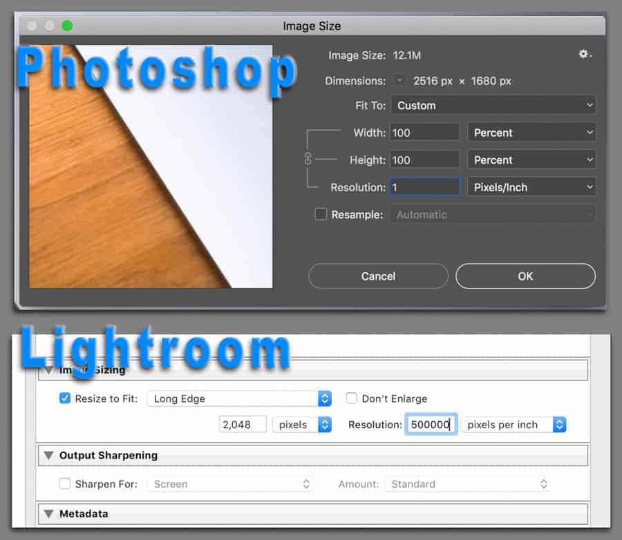
Go into Lightroom and Export a file with a RESOLUTION setting of 1 Pixel Per Inch and then export that same file with 300 Pixel Per Inch setting and you’ll see the file size and everything else will be identical – EVEN when zooming way into the pixel level. Nothing changes at all.
PPI ONLY has an effect when it comes time for printing since the pixels per inch will dictate, on paper, the density of the DPI from the printer.
Every display has a set pixel density. This is a physical number than CANNOT be changed; it is simply how the display is made. This is why it makes no difference whatsoever what you choose for the RESOLUTION (PPI) when exporting. In the above image, notice that I put in “1” in Photoshop for PPI Resolution and below that, in Lightroom, I put in a ridiculous number like 500,000. It simply doesn't matter for digital viewing! Here is an example of PIXEL DENSITY or PPI:
I use an Apple iMac 5k Retina display. It has a native resolution of 5120-by-2880 pixels. Those pixels are the pixels that PHYSICALLY make up the display. To figure out what the PIXEL DENSITY of a display is, there is a simple formula. It is PPI = √[(X*X)+(Y*Y)] / N.
X = the width which is 5120 and Y = the height and that is 2880. N = the diameter of the display and that is 27 inches. SO 5120×5120 is 26,214,400. Then take 2880×2880 and you get 8,294,400. Add them together and you have 34,508,800. The square of that is around 5875.42. Divide that by 27 and you get 217.6 which is 218 Pixels Per Inch and that is exactly what a 5k iMac is!!! To make that much more simple, check this out for kicks and it will show you the PPI of any display! HERE
What does all this mean? NOTHING! I was just showing you how to calculate the PPI (Pixel Density of your display) if you were curious but it is made to show you that your display is your display and a software setting in Lightroom or Photoshop isn't going to change the PPI of your digital file when viewed on a screen.
DO NOT GO INTO PHOTOSHOP TOO EARLY
If you are an Adobe CC subscriber with the Photographers Plan or the whole suite of Adobe Creative Applications, you have access to Lightroom as well as Photoshop. When people start using Photoshop more frequently, we all tend to forget that Lightroom is a RAW editor and it is 100% non-destructive and you can get back to any and all edits very quickly because of this.
In Lightroom, the file is never saved unless you are exporting a copy of the image out to file as a JPEG, for example.
Once you work on a file in Photoshop and save these edits back into Lightroom (Round Tripping), these edits aren’t so quick to fix anymore. You’d have to open the file back up AS ORIGINAL in Photoshop, go back into Photoshop and then go through the layers of adjustments or whatever else you did to get back to these changes. It can be quite a pain!
Just make sure you do everything you can possibly do in LR before moving over to PS to keep your editing flexible. There is also another way to keep things flexible and that is by opening the file from Lightroom into Photoshop as a smart object. This preserves all the RAW edits and you can get back to these edits at any time by simply double-clicking on the Smart Object Thumbnail within PS. Here is a LINK to an article I wrote about using a Smart Object Workflow if you’re interested.
WORK NON DESTRUCTIVELY
The most powerful part of working with layers in Photoshop is the ability to work NON Destructively. What exactly does that mean???
Non Destructive workflow means that you never actually alter or harm the actual image master file or the pixel-based original layers inside of Photoshop. The greatest thing about using Lightroom and Photoshop together is that you always have a truly 100% non destructive workflow. Your imported RAW files are always in the same place that they were imported into physically (Unless you move them) and they are never altered in any way other than some metadata and the file name if you choose. That is another benefit of shooting RAW – you never touch the actual file because changes are written to a file or catalog and not the actual file like a JPEG.
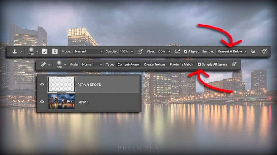
You make all the edits that you can in Lightroom and then open up the file into Photoshop. Once in Photoshop, you will start off with a single layer (Unless you choose several images and open as layers into Photoshop – then you will have two or more layers) and instead of working directly on that layer, you can add Adjustment Layers. This differs from going to IMAGE>ADJUSTMENTS in the menu. When you do that, you’re making changes to the pixel layer that is currently selected. Instead, choose the little black and white circle at the bottom of the Layers Panel to Add an Adjustment Layer or better yet, learn the shortcuts (more on that below). Additionally, Dodging and burning, repairing the image via the clone stamp or healing brush tools should all be done on separate blank layers to maintain a non destructive workflow whenever possible! This makes it very easy to go back at any time and make changes.
DO NOT OVERUSE FILTERS
There are many very cool filters in Photoshop and each of them have many uses when combined with the creativity of the user. These filters may seem basic and very fundamental when first exploring them but when used with the right goal some of them can produce fantastic results.
Filters such as the Liquify filter have been known to add or take away a few pounds, alter the shape and size of this and that and many other things. Make sure when using a filter such as the Liquify filter that you are aware of the surroundings because crooked lines can be a sure fire way to tell when editing has been done and done poorly!
Adding a little Gaussian Blur to a layer and then lowering the opacity can give your image a surreal, dreamy look but don’t over do it!
Filters are one area in Photoshop where they must be applied either directly to a pixel containing layer or, the better way, to a smart object. More on that in a moment.
DON’T LOSE YOUR WORK BECAUSE IT WASN’T SAVED!
It doesn’t matter what computer system you use and how careful you are when operating it. Sooner or later, you’ll be working on a file and Photoshop will lock up! PANIC! You may think “I have been working on this masterpiece for 3 hours! Oh no!!” Have no fear – you have options.
The first would be to CMD/CTRL & S your document every so often so that your file is saved and worse come to worse, you can always go back to those latest edits if indeed your system does crash. This could also be a power outage. Either way, you don’t want this to happen!
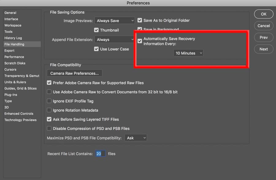
Another more effective way to make sure your file is backed up but this time automatically is to set an interval of time in Photoshop’s settings to go in and save your work in case of a catastrophe!
In the PREFERENCES setting under FILE HANDLING, this screen will appear. Make sure to have the check mark on Automatically Save Recovery Information Every ###. You can choose from every 5 mins up to every hour. The more frequently, the more system resources will be used so be aware of your system’s limits.
AVOID THE OVER RE-TOUCHED LOOK
Super white teeth. Unnatural plastic looking skin. These are two of the most common Photoshop errors made by novice Photoshop users. We have all done it. Some more than others. Avoid doing this at all costs!!
When it comes to teeth, it is actually better to simply take away color via a black and white layer and then painting that adjustment on teeth and then adjust the layer opacity until you achieve the desired results. It really works very well without giving you those ridiculous teeth that are whiter than snow.

As far as skin retouching goes, there is a popular technique called “Frequency Separation” where you have two layers – one for the color and the other for texture – and they can be worked on individually without one having an effect on the other. That technique is outside the scope of this article but you can find dozens of quality tutorials on YouTube on how this is done.
I mention it because I, along with many others, have gone crazy with this technique when first learning it and came out with some ridiculous, plastic looking faces. If you’re not careful, you can go too far. As with any technique, subtle and natural looking is always best.
DON’T NEGLECT AN ORGANIZED WORKFLOW
When working on layers in Photoshop, one can get very disorganized quickly if not careful. With large, multi-layered and multiple image documents blended together using text, shapes, layer masks, adjustments, etc – your file can get out of control pretty quickly. It is very easy to fall into the trap of having it all in your head while working on the file. But what happens when you stop for the day and don’t reopen that file for a day or two? When you go back you’ll see a bunch of layers that you have no idea what they are for.
This is when layer organization comes in. Carefully and thoughtfully labeling your layers goes a long way. A generic “Curves 3” label isn’t going to tell you exactly what that adjustment is for. Maybe it is just for the eyes on a portrait? Argh! Simply labeling these layers makes taking a quick glance at your workflow a breeze.
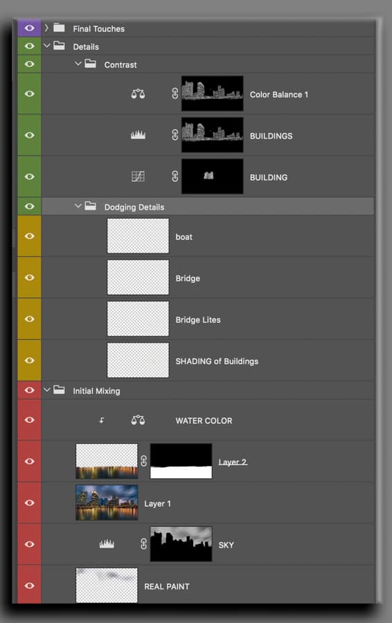
But it doesn’t stop there. When you right-click near the little EYEBALL on the layer, you’ll see the options for color coding your layers. It is super important when dealing with huge files to be able to see what goes with what and color coding is a very big help!
Folders are another great lifesaver in terms of Photoshop neatness! They can, of course, be combined with color coding to make sure you’re super organized and able to zero in on any adjustment you have so carefully made and labeled.
It gives you a sense of professionalism and it will make your photo editing and enhancement life a lot easier down the road.
If you want to get into complex compositing, it is pretty much a needed thing or else you’ll go crazy trying to navigate your layers panel.
DON’T FORGET ABOUT SMART OBJECTS!
One of the most powerful features of Photoshop is the ability to use Smart Objects. There are many reasons why Smart Objects are powerful and in this article, we will mention two key uses for Smart Objects.
First, smart objects can be resized up and down and many times as you’d like without losing at image quality at all. This is because you’re not actually rewriting the pixels. Instead, you’re just altering the container (The Smart Object) that contains this image info and any layers that may go with it.
Another really great use for Smart Objects is the ability to use SMART FILTERS. This is basically the same thing as going to the FILTER menu and applying the filter to a pixel containing layer but unlike applying a filter to the pixel layer, you’re applying it to a Smart Object and this means you can go back and modify that filter at any time. You also get a Smart Filter mask. This is similar to a layer mask but the difference is only the filter can be masked out or in using this mask. You can find an earlier article I wrote on Smart Objects HERE!! Be sure to check it out!
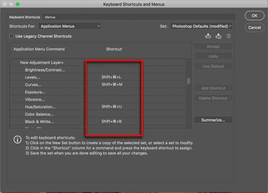
NOT USING SHORTCUTS IS A BIG MISTAKE
This is short and simple. You need to learn Shortcuts to use Photoshop effectively. There really isn’t any sugar coating this. You may watch YouTube videos where the instructor is showing you everything step by step and it is all nice and controlled and that is just fine for learning.
However, if you truly want to use your creativity in Photoshop or ANY OTHER CREATIVE APPLICATION in the world today, you NEED to know the shortcuts. Period. This also helps when you're learning because you can then follow along on a video tutorial much quicker. You can even create your own custom shortcuts to make them work for YOU! The flexibility is there and it gives you total control over the application. You need to control the software; NOT the other way around!
If the technical aspects of photography & post production get in your way, you can be the most creative-minded person on the planet but your vision will never be realized because the “TECH STUFF” is getting in your way. I can personally attest to the importance of learning and practicing Photoshop Shortcuts. Since learning the Shortcuts in Photoshop became a priority for me, I can now think of a concept and zip right through the application and do exactly what needs to be done without even thinking of the keystrokes. I cannot stress this enough!
When you become fluent with Photoshop shortcuts, it is literally like using a pencil – you just pick it up and use it! Once your workflow gets to that level, you can start to create what you see in your mind. Until then, you won’t – So learn the shortcuts!!
EXPORT TO sRGB WHEN POSTING TO WEB – ALWAYS!
Color Spaces can be a very confusing subject for many. I have even seen some “Experts” contradict other experts on the topic of color spaces. There are two different paths with color spaces. One is your editing workflow and the other is the output workflow. They are TWO VERY different things. When you are working with your images in Lightroom, you are working on the RAW image data and it is with the WIDEST COLOR space available called ProPhoto RGB (or a slight variation of it to be technical). You do not have to worry about this setting in Lightroom because it is just the way it works; there is no way to alter this.

When you hand the file over to Photoshop, you then can assign a color space to the file for further editing. The choices are ProPhoto RGB, Adobe RGB (1998), Display P3 and sRGB. Lightroom recommends using ProPhoto RGB because it retains the color information from Lightroom.
So now that we are in Photoshop and we do what we want to do with the file, you can send it back to Lightroom. If you wanted to, you can also export the file out to a JPEG file straight from Photoshop but regardless, you'll want to make sure to EXPORT TO FILE in the sRGB color space.
Why would we want to do that? It is simple – THE WEB WORKS IN sRGB! There are so many displays, devices, and browsers and they ALL support sRGB. If you do not export in sRGB, your colors can be off on some computers, devices, and different browsers. This is VERY important to remember. ALWAYS export your files to sRGB when you wish to post them online to social media, a website, blog, etc. This will assure you that your file will look as close to what you created as possible without weird color shifting.
If you have any comments or questions, please leave them in the comments section below! Happy Holidays to ALL!
SO, SO MANY handy tips here …a lot of reading but most insightful.
One item particularly is of interest to me, the “Export To File in sRGB colour space. I have recently had a number of prints coming out lacking colour and with a greenish tinge. Even prints that have printed correctly b4. I have re-calibrated my monitor without effect …I will have to check my Desktop settings!!
Really great tips and reminders here. Thanks!
I’ve been using Photoshop a whole lot more lately, this is a very timely article for me. Awesome!
It is the great article here such the nice.