
Adobe Photoshop has tools on top of tools and they have many uses. There isn't really a “wrong way” to use many of the tools. There are so many ways of doing things – the end result is really the only thing that matters. You will often get results that you didn’t even have in mind during your workflow. You then have an idea that pops into your head and then you implement it because you have learned to work with these many tools which allow you to create, create, and create!! Photoshop “Blend If” is a power tool you need to know about!
BLEND IF SLIDERS IN PHOTOSHOP
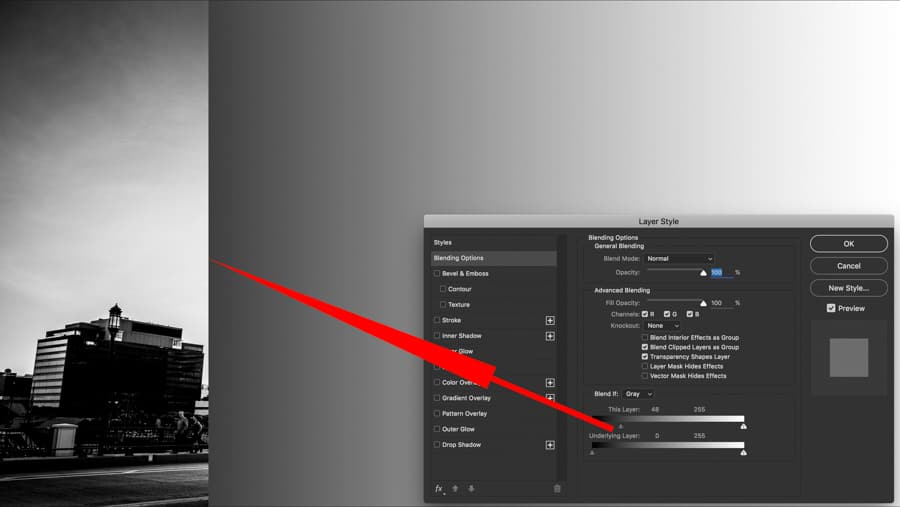
The Blend If sliders in Photoshop are buired within the layers style dialog box. They can be most easily accessed by double clicking that layer you wish to access the Layer Style Dialog Box for. Another shortcut would be to just hit SHIFT+CMD/CTRL & O (As in “OH” – not zero). Don’t tap on the ICON or the text but rather the area around the text on the layer. This BOX will appear:
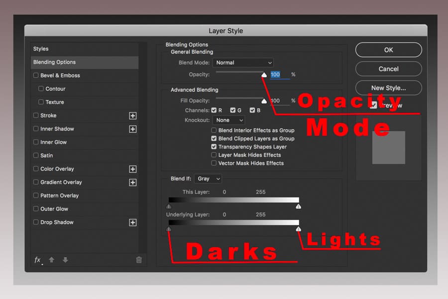
The Sliders we are most concerned within this article are the TWO sliders toward the center and at bottom. We have “BLEND IF: GREY” and then the THIS LAYER and UNDERLYING LAYER sliders directly beneath. There is a gradient scale of 0 (BLACK) to 255 (WHITE). “THIS LAYER” signifies the layer that you would have doubled clicked to make this box pop up and the “UNDERLYING LAYER” means the rest of the image beneath “THIS LAYER.”
I have also pointed to the BLEND MODE and OPACITY sliders as they are of vital importance when using these other sliders as you will want to experiment with the multitude of blend modes to suit your taste and also vary the strength of the particular look by using the OPACITY slider.
HOW THEY WORK
The THIS LAYER slider will effect how the TOP layer reacts with the rest of the file and isn’t really where the power lies when using these sliders. Before we get to the UNDERLYING SLIDER, you must take note here because this is the most important part about these sliders.
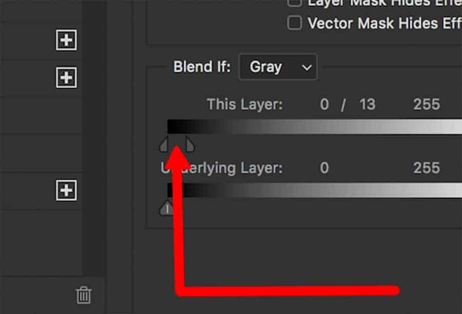
There is a little SPLIT line between the little arrows. Instead of just dragging these sliders as a whole, you can FEATHER the tonal range by holding down OPTION/ALT and dragging these little sliders apart. This will feather the tonal range which is of huge importance. It will give a nice gradual transition instead of an abrupt one.
The real use for these sliders comes when using the UNDERLYING LAYER slider as this will determine how the IMAGE will interact with the Layer that was placed on top of it – whether it be a solid color, gradient map, sharpening layer, noise reduction, etc.
The ability to specifically, and visually on the fly, adjust by tonal ranges how your document will work with the layer you are applying to it is where the true strength of the BLEND IF SLIDERS lie.
Here is an example image where I won’t spend a bunch of time trying to create a compelling image but rather show you how simple is can be to blend two images together using this technique.
I will add an ominous cloudy sky to this scene using the BLEND IF SLIDERS.
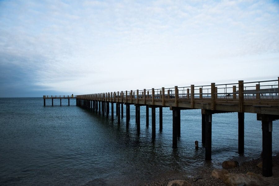

This sky will replace that sky above.
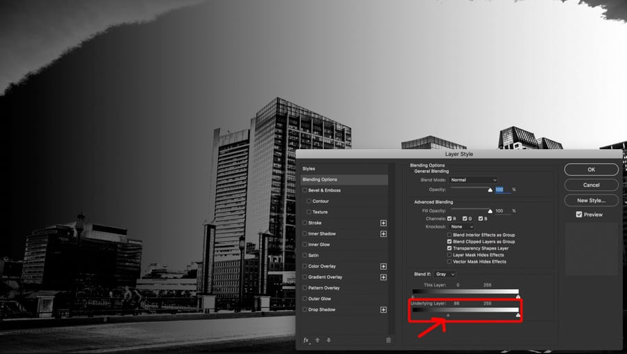
With the cloud layer on top, double clicking on the layer outside of the ICON and not on text will open Layer Style dialog box. Here is where going to the UNDER LYING LAYER slider and sliding the two half parts of the slider (By holding OPT/ALT while sliding) and putting the left half of arrow at about 65 and the right side at 121 Results in this blend. Not perfect but since this is a fairly straight forward image, applying a simple layer mask to the top layer and then painting out the clouds that leaked into the lighter areas of the water with a black brush, you will be left with a sky that is blended well. No need to make selections around the hand rails that touch the sky. The blending will take care of this perfectly.

Now since the water is much more blue than the sky, we can add a HUE/SAT layer and CLIP it to the bottom layer by hovering our curson between the HUE/SAT layer and bottom layer. You will see a little white box with down pointing arrow. Click and this will clip the adjustment to bottom layer. This is how you clip adjustment layers to layers below them, by the way. Now simply desaturating the layer a little will bring it in line with the look of the clouds for a uniform and realistic look!
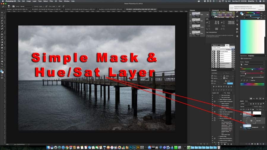
This certainly isn’t a work of art by any means but it shows you how simple it can be to use these powerful sliders. When you combine the BLEND IF SLIDERS with layer masks, you can really get some great results.
Don’t forget, there are also 3 color channels that you can use the BLEND IF SLIDERS with and this is a good video on YouTube that explains in detail how this works. CLICK HERE!
It can be confusing at first. REMEMBER – THIS LAYER (The top slider) will effect how THIS TOP layer interacts with the document. THE UNDERLYING LAYER SLIDER will effect how the layers below the top layer interact with the top layer! Very confusing and it sounds similar. These two images should help if confused:
NOISE REDUCTION WITH BLEND IF
Now that you have an idea about how these sliders work, you should start getting ideas about how you can use these sliders in your workflow. A great area where this comes in handy is using this technique when using noise reduction. I personally find that Topaz Denoise works very well and I like to use a Topaz Filter layer and then activate the BLEND IF method from within the Layer Styles Dialog.
Noise usually is the biggest issue when in the darker, murky shadow areas of our images. This tells us the it is a good idea to leave the LEFT sliders be as they may because we do WANT the noise reduction to work most in these areas since digital noise is a signal to noise ratio issue and where there is low light in an image, there will naturally be more noise. Look at this image below.

Noise reduction was applied to the entire layer but by using the WHITE (255) side of the Blend if sliders, I was able to keep the very strong noise reduction in the black areas while not affecting the brighter areas of the image.
The nice thing about this is you can see a live preview as you are doing it. You don’t have to apply changes and then look to see how they are done. It is done in real time as you do it and view it!
Isolating ICONS
This is one trick you will definitely want to know. Have you ever had an icon or text from an icon or logo you wish you could take out of that icon or logo and apply layer styles such as a drop shadow to? Well with BLEND IF sliders and the THIS LAYER slider, it is very easy!! Here is a logo from IMPROVEPHOTOGRAPHY.COM but I want to remove the WHITE background from it.
![]()
You may be thinking just use SCREEN blend mode but that won't work because the layer style will not work with it since it thinks the white is still there. You will get a shadow around the entire logo and the square that was white. If you double click on the Logo and use the THIS LAYER blend if slider and slide the 255 slider slightly to the left, you can then feather the slider by splitting it slightly (OPT/ALT). Now create another blank layer and merge the two (CMD/CTRL + E) and you will now have the logo isolated and can apply layer styles to it!! A great and very useful trick!

SELECTIVE SHARPENING USING BLEND IF
The concept for these techniques are all basically the same. The only difference is the method that you are trying to apply. Sharpening is yet another option when using the blend if sliders. This is a very simple method yet also very effective:
- When ready to sharpen your image in Photoshop, make a top CLONE copy of your image.
- Go to Filter>Other>High Pass. Adjust the RADIUS to your desired amount. Image size and other factors will dictate the Radius.
- Change the Blend Mode of this to Overlay or for real aggressive sharpening, LINEAR LIGHT.
- Now double click on this layer to get to the BLEND IF sliders.
- Adjust the lower ends and upper ends of the tonal spectrums by experimenting with what looks best. Remember to ALWAYS use the OPT/ALT key to feather these sliders for smooth transitions.
Sharpening works best in the darker mid to mid tone areas of an image in many cases. Skies, bright areas without detail, etc – they can become very noisy if not careful so you'll want to restrain your sharpening as to not effect these areas.
Don’t forget that you also have the OPACITY slider to determine the overall level of sharpening or whatever else you may be doing when using the Blend If Sliders.

BLEND IF vs Luminosity Masks
You may be wondering why one would go through this when LUMINOSITY masks and selections are available to us in Photoshop. And that is a very good point. When you need on the fly blending and want a little bit of flexibility on the fly, the Blend If sliders work very well. Luminosity masks can also be adjusted by using levels and curves to adjust and create custom Alpha Channels as well. As with most things in Photoshop, there are many ways to do the same thing and each method can, at times, have an advantage.
As you become more familiar with Photoshop, you will know when it is time to use what tool and why. There are many tools in this wonderful and extremely powerful application and they are all there to be used! I cannot overstate enough how important it is to not only follow tutorials along with the instructor but also how important it is to practice with your own work, in your own time and in your own way.
You will begin to see why a certain tool works in a particular situation and why one won't or isn't the best option!
KEEP on SHOOTING and EDITING! And always leave a note or message me on Facebook with any and all questions!
This is such a great tutorial, Brian. I especially love the noise reduction feature, really can see the difference. I will have to check it out, never noticed this option before, if I’m honest *hides*
Alex, thanks! You can use these sliders for so many different things. It’s very good at color grading. You can get ultra specific. It’s the tools on top of tools in PS that make is the app that it is. So great!
Saw the Article title and knew 2 things: 1) this was a Brian Pex article and 2) I was about to learn something new.
I was right on both. Great stuff as always Brian. Especially the noise and sharpening points.
THANKS! Glad it helped!