
I would like to offer up a few quick and easy tips to help make your ocean/beach photography stand out. I have spent the past week shooting a lot of beach and surf photography for a few different clients. Some of this work was actually in an event setting, so there was a lot of feedback and response to the various images, and a very substantial portion of that commentary and interest was based on the way the images were post-processed, rather than how they were shot in the first place.
When I am in “fine artist” mode, and creating work purely for my own gratification, I would tend not to inquire about “which look” other people enjoy. When I am in that artistic mode, I create for ME, and I hope that the world likes what I like. When someone hires me to shoot a wedding, they are hiring me to produce images that look like MY type of photography. However things change when you are working specifically for a client that has a specific goal or desire in their imaging. It is also a different scenario when shooting an event, and you are hoping as the photographer to provide something that will entice buyers of many different preferences and sensibilities.
So here is the background on the three examples for post-processing challenges and solutions:
A) A small-business owner has hired me to create a series of images that will cycle on a monitor that is hanging in his surf school. The images will never be printed, but he wants a ton of visual “pop” to advertise his surf instruction services.
B) A group of mothers have asked me to create a series of photos from a surf camp that is taking place this week. Most of the participants' parents are not here to see the camp, so I am sharing out a gallery of photos each evening, to document the day.
C) During one afternoon of shooting, a controlled burn took place in a nearby forest, which caused a massive plume of dark brown smoke to pass in front of the sun, and to severely tint my raw images. I needed to present these photos to the parents of surf retreat participants, so I needed to find a way to “make the best of it.” I will explain the greatest challenge in this, and how I dealt with a very prominent brownish tint to my raw files.
This article will share all three examples of how I addressed the images in post processing to create greater interest and impact.
Example Number 1: Surf Instructors
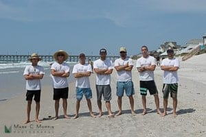
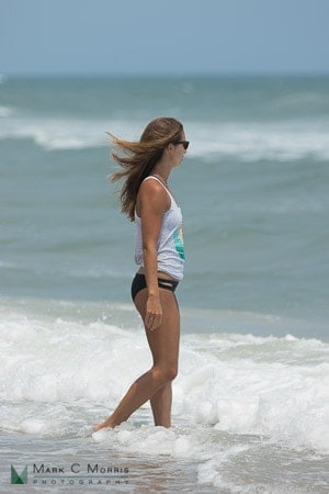
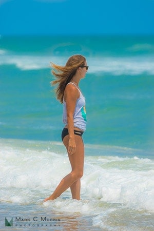
This is one of the images created for the Surf School. The top image is directly out of camera, and the bottom image is the processed version. My processing was done exclusively in Lightroom, nothing was done in Photoshop. Here is my work flow for processing the photo:
- The image was shot at a white balance of 5900. I always start by testing a neutral gray spot with the “eye dropper” tool for reference. I shot the image at 5900, and the eye dropper tool moved the slider to 5877. That is practically not even a change, but I kept it, since it was a tweak toward the cooler side of the spectrum, and that means more blues.
- My second step is typically to push the shadows up as far as I can get away with, and pull the highlights down. That's exactly what I did here.
- I set my white & black levels by holding down the ‘option' key while moving the black & white sliders respectively. I adjusted both to the point where there was nothing completely over/under exposed.
- The photo just looked a bit ‘flat.' I wanted to bring out the vibrant beauty of the beach, so I spent some time basically using trial and error with the “presence” sliders. (Clarity, Vibrance & Saturation.) I do not have a set ‘system' for adjusting these sliders, but I very rarely leave them untouched. In this particular situation, I had instructions from the client to produce vivid, dynamic colors. So, I started by pushing the saturation. I hated that look. Vibrance, however, really helped the photo ‘pop.' I also added just a touch of clarity.
- There was definitely a bit of a ‘hazy' look to the photo, and easily one of my most favorite recent additions to Lightroom is the “dehaze” slider. For the image above, I pushed the dehaze to 29. This slider is almost magical in the way it can transform an image, but with all good things there is a possible drawback. In the case of the dehaze slider, if there is too much applied, I find that there are a lot of very negative artifacts in the photo. In this case, I liked the way it pulled out the tiny white cloud. When I got to the point where it started to feel entirely too processed, I pulled back a bit, and ended up at +29 for dehaze.
- I have found that dehazing often has the overall effect of darkening down the photo. My own personal work-flow is to head back to the exposure slider after I have worked down through the various sliders, and finished with “dehazing.” With the photo above, I ended up bumping up my exposure by .5.
- I always do a bit of an “S” curve in the tone curve section.
- In the HSL section, I just automatically bump the reds down to -20 because I shoot Canon. There wasn't much red in this photo, but I pulled it down just out of tradition.
- The rest of the color sliders stayed basically at zero, except a very tiny push of the blue slider (+4).
I actually worked through this photo several different ways, but the edit described above was the hands-down favorite of my client.
Example Number 2
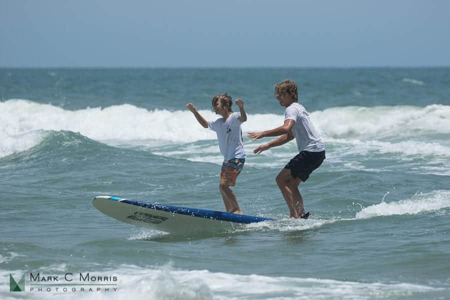
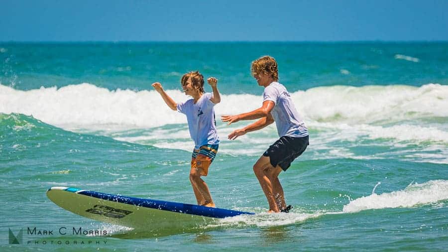
I selected my second example from a photograph that I took yesterday. The unprocessed image was just ‘flat' looking. The lighting was pretty decent (albeit a bit harsh, due to mid-day sun,) but before processing the image, the look of the image doesn't demand the viewer's attention.
Rather than begin the processing from the very beginning, I created a user preset, using my previous edit from the surf coaches. The creation of your own presets when working through a large number of images is an incredible tool for efficiency. This particular shoot was for a surf camp called “Cowabunga Surf Retreat.” I was blanket shooting the 3-hour event, and then providing the images in an online gallery. My biggest concern is that there will be a wide array of individuals searching through the images, so I wanted to try to appeal to a couple of different preferences.
For those who have not created your own preset, it's incredibly easy! Let me pause briefly to explain just how simple this is.
First of all, edit a photo exactly as you want your preset to look. While still in the “DEVELOP” module of lightroom, use the left panel and navigate to “Presets”. There is a + sign to the right of the “preset” label. When you click that plus sign, it will open up a dialog box that will look like this:
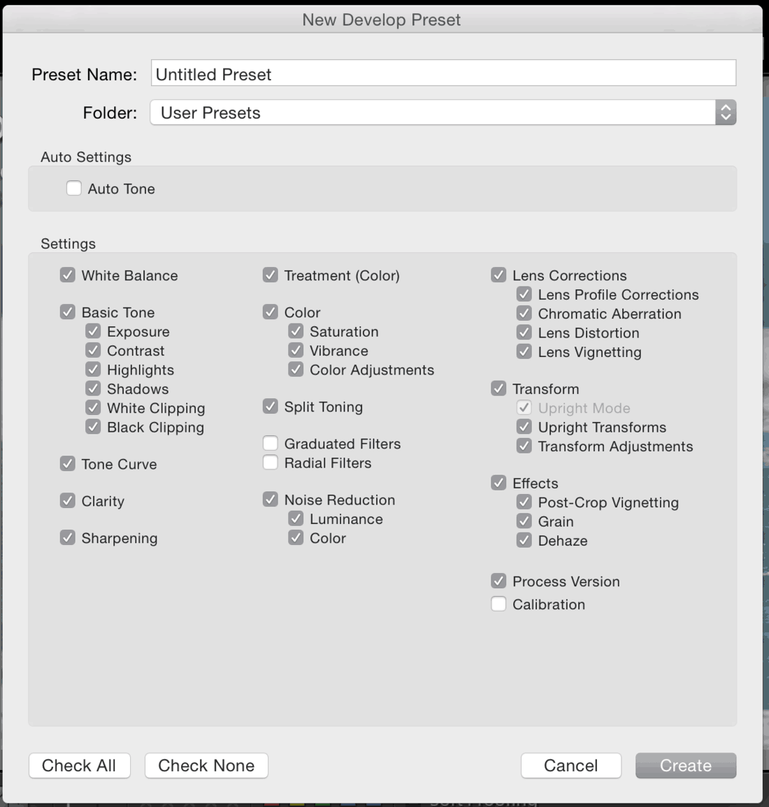
As you can see, this dialog box allows you to name your preset. It also allows you to save your created presets in various folders. This is incredibly valuable for organizing your preset library by types/styles of photography. If you do various types of photography, it's a great idea to establish different folders for each type, so that as your pool of created presets expands, you can find the relevant options quickly and effortlessly. The whole point here is to increase speed and functionality. Spending 5 minutes looking for a preset is just as inefficient as taking 5 minutes to re-edit the photo from scratch!
You can see the various choices for items that should be included in your preset. In the screen shot above, the graduated filters and radial filters were not included. The reason that I did not include them is that the horizon line will be slightly different in each photo. If I wanted to apply a graduated filter to the image, I would do so in a case-by-case basis.
My goal with the event that I was photographing was to have a few different basic “looks” to use. After my initial edit, I made a couple of variants, and labeled them accordingly:
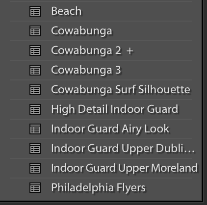
The four “Cowabunga” presets are the ones built for this specific event. As I cull my daily photos, I apply one of the four presets to each image. I also do any necessary cropping while culling, since the name of the game here is to produce a very large number of images, very quickly. My intention is to always have event photos posted the same day as the event. From a sales perspective, I want to have the images in front of the participants' eyes as quickly as possible, so they are still emotionally attached to the event, and willing to commit to purchasing images.
Example Number 3
For the first 1.5 days of shooting the surf retreat, the water was absolutely stunning. The clear, lovely water truly “makes” the photos as beautiful as they can be. About halfway through the second day, there was a huge plume of smoke from a nearby forrest that was being burned intentionally, for wildlife resource management. The plume of smoke wasn't a huge issue for the first 30 to 40 minutes, but eventually the brown cloud of smoke passed directly between us and the sun. Our beautiful blue/green ocean turned instantly a drab brown.
It is a very rude awakening when you have been capturing lovely light and colors for two days of an event, to then suddenly find the entire world that you are shooting turning to a very dingy taupe. Depending on the specific area of the ocean that is in the photos, I was definitely able to get use out of some of the photos that were impacted by the forest fire.
The example above is just one of those cases. The woman in the photograph has a tanned complexion. The browning effect of the smoke screen of the sun actually tinted her skin in a favorable manner for a beach photo. It may have been the world's safest fake tan!
The problem here is that I ONLY need to impact the water, and not the rest of the image. My solution in this case was to use a brush. I selected a saturation brush, and then very carefully selected the non-skin parts of the image. I pulled out the blues and greens via that brush, but left he skin alone. While this level of hand detailing makes for a very tedious editing workload, at least it is available as an option in the case of just this sort of an emergency.
As you can see in the images above, the photo was entirely usable, after addressing the colorizing due to the forest fire. This type of editing takes MUCH longer on a per-photo basis.
How Do I Begin???
Perhaps the best way to gain a better understanding of creating different looks within lightroom is by studying how different looks are created by other photographers! If you happen to be reading this article on the date of publication, you may still have a few minutes remaining to purchase the 2016 Lightroom Steal. Before I ever felt confident enough to build my own presets, I constantly used the presets made available by Jim Harmer. If you haven't purchased lightroom presets previously, I would highly suggest getting some good ones, and dissecting them, to see how each control was used to impact the overall look of the image.
After you have gotten comfortable with using presets that were entirely designed by another photographer, you will begin making adjustments and modifications to those presets. It's a tremendous time saver to start with a superb preset, and then just put your own “finishing touches” on the style by making small tweaks and adjustments.
As you can see in all three examples, a RAW file directly from the camera is not “ready” for consumption. Learning to control the post-processing side of photography will make a massive difference for anyone learning the art form. Best of luck to all of you as you expand your technique and personalized looks!
I followed your photos the past few days on facebook/instagram and loved them! That had to be a fun “job”! Thanks for sharing your pointers on post-processing. I have so much to learn.
To be honest; I find the editing horrible. Skin tones are to much saturated and the color cast on the water far from correct.
I agree with you