
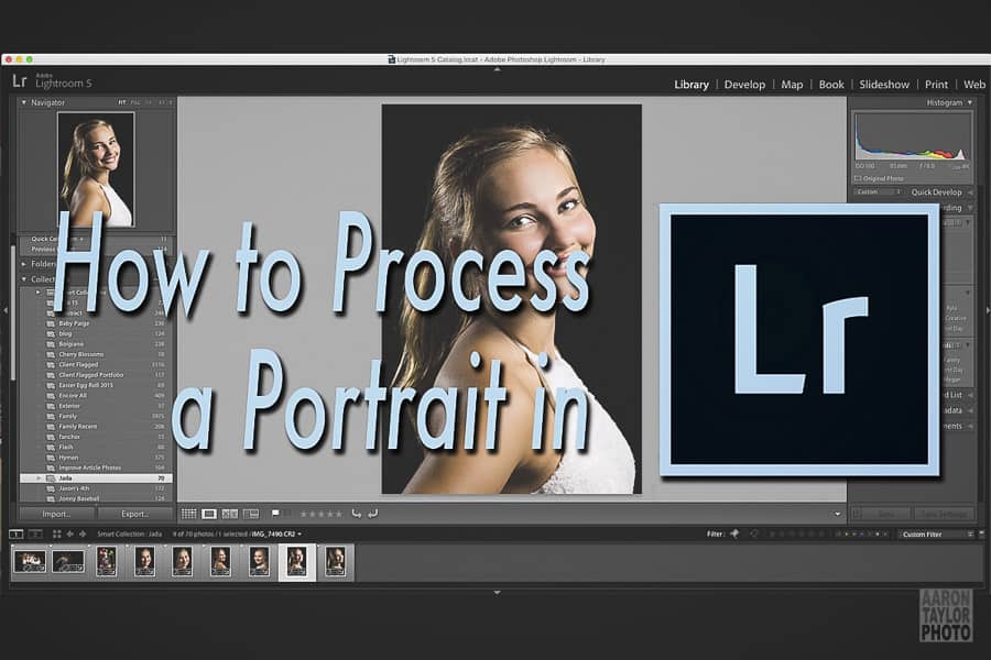
Whether you’re brand new to Lightroom or if you’ve logged many hours in the program, learning how to process a portrait efficiently and skillfully is a never-ending process. There’s always one more thing you could consider to enhance your images. What I’ll do here is take you through the process I’ve developed after about two years of steady experience with LR. Thankfully, LR is intuitively designed to make this process straightforward. In fact, I rarely deviate from the order in which the Develop module is organized. What I describe here isn’t anything fancy or complicated. I’m simply going to tell you step-by-step how I process a portrait to get a classic, timeless look. No creative coloring or effects here, just a good, clean image.
For this article, I won’t describe my culling process. Let’s assume that you have a good photo and you are ready to edit.
Summary of Steps
Before I give you the details, here is the overall order in which I edit a portrait:
- Straighten and Crop
- Exposure
- White and Black Clipping
- Highlights
- Shadows
- Contrast
- White Balance
- Clarity, Vibrance, Saturation
- HSL Panel
- Detail, Effects, Lens Corrections
- Graduated and Radial Filters
- Spot Removal
- Adjustment Brushes
While that looks a lot, I don’t do all of them every time, nor do I spend much time with most of them.
Quick Tips Prior to Editing
You should shoot RAW for two reasons. One, a RAW file is much more forgiving than a JPEG file. You can miss the exposure and white balance settings in camera and still end up with a quality photo once you edit. Two, you can play with a RAW file more than you can play with a JPEG. Again, this relates to the level of forgiveness a RAW file gives you. Unless storage space or shooting and delivery speed are priorities, then you should shoot RAW, especially if you’re still learning your camera’s settings and the exposure triangle.
When you import your photos to LR, do your keywording right then and there. If you’re like me, you’re much more excited to edit than to organize. If you jump in and begin editing a session right away, you’ll probably forget to add keywords to your photos later. You’ll kick yourself a month or a year later when you go to find that photo and have to search and search because you didn’t keyword properly. I tend to keyword the name of the person, the location, and whether the photo is for a client or for family. If you’re interested, the Improve Photography Lightroom Medic course including with Improve Photography Plus will give you much more to think about when it comes to organizing your photos.
Finally, I have a preset settings I apply during import to most of my photos. The preset I use does some minor things that I tend to do to each photo based on how it comes straight out of my camera. For example, I used to shoot with a Canon T3i. I always found myself boosting the shadows and blacks a bit to prevent my photos from having clipped blacks (that’s when the darkest parts of your photo are pure black, no detail). I ended up creating a preset that automatically increased shadows and blacks upon import so that I didn’t need to think about it.
The images from my Canon 6D are different. I don’t increase shadow levels anymore, only blacks just a bit. Pay attention to what you’re always doing in the Basic panel, and create a preset to help speed up your process. I also include in the preset the things I always tend to do, like increase contrast, add a bit of vibrance, sharpen, and such. My import preset doesn’t do too much, but it does enough little things that I appreciate not having to think about them for each photo.
However, for this description, I’m going to walk through my process without a preset applied upon import. That way, you get the full scope of a portrait editing session.
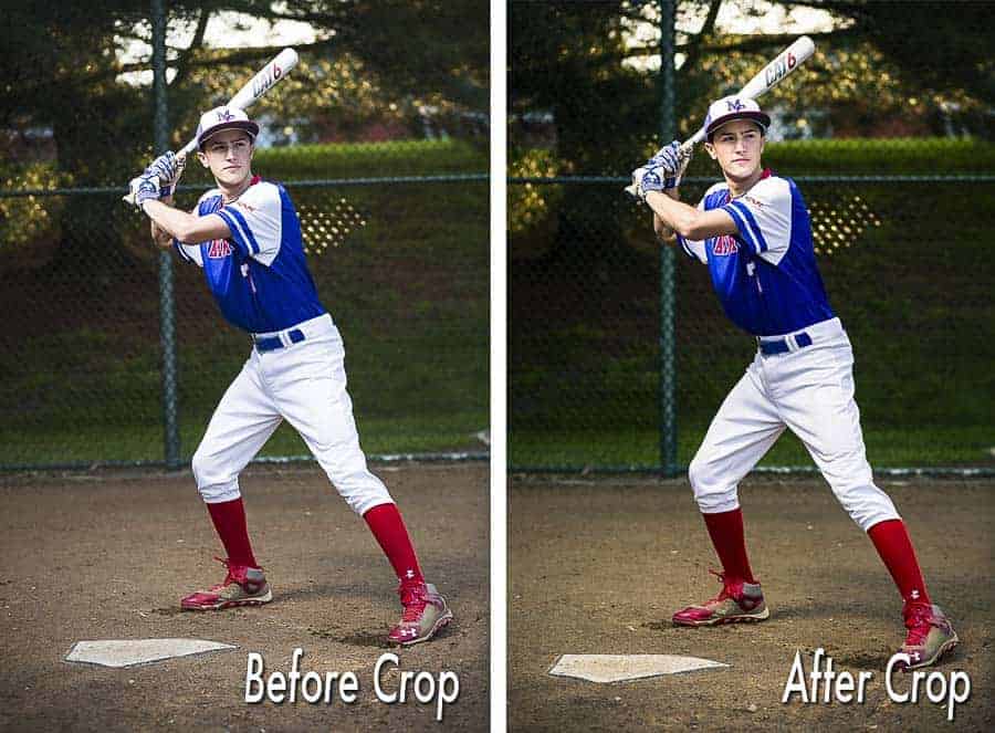
Part 1: Crop and Straighten
Before I touch any other settings, I make sure that I like the composition. Do all of the elements look good the way I intended to arrange them? Also, while I try to keep my horizontal and vertical lines straight while shooting, it’s not always possible, especially if you take photos of families with little kids. That means the first thing I do is straighten the horizon. If there is no horizon, I look for a horizontal or vertical line near the subject that should be straight. Often this line is a window frame, door frame, bench, or chair. Ensure that those lines are straight before you do anything else.
I recognize that some photographers like to purposefully tilt their image. There’s a difference between a purposefully tilted image and a crooked image. Make sure the tilt is a choice you made, not a mistake you forgot to correct. And tilt with discretion–a few per session seems okay.
After you straighten your main horizontal or vertical lines, make sure that your image is composed and cropped well. Ideally, we’d compose perfectly in camera, but for those of us who aren’t perfect, check your composition. First, I check the edges of the frame. Is anything just barely touching or just barely being cut off? If anything is just barely on or off the edge, I make a more purposeful crop. That way, the composition looks a little more comfortable and deliberate.
Next, pay attention to how you are cutting off body parts or a part of the head. Don’t cut off at the joints (knees, ankles, wrists, elbows, etc.). Cut off in the middle of a forearm or the middle of the thigh. Try not to cut off parts of fingers or hands. For hands, I often think to myself that it should be all or nothing. Be careful that you don’t cut off just a millimeter of the top of the head or just a fingertip or shred of elbow. Be more purposeful and cut off more.
When I browse other photographers’ images, I often cringe at images that have something too close to the edge or just barely cut off. I also cringe when the image isn’t cropped in close enough to the subject. Almost every photo I see of people can be cropped in tighter. Portraits are rarely about the scenery. They’re about people, so get us closer to the people.
Before I move on, I just want to reiterate that cropping and straightening your image is a really important step. A poorly composed photo can never be saved by the rest of this process. You are in control of how the viewer sees all of your image. Make sure they see something good.
Part 2: The Basic Panel – White Balance and Tone
I correct the exposure next. I need to be able to see my image adequately onscreen for every other adjustment, so I need my exposure to be right. Sometimes I get it right in camera, other times I don’t. Even if I think the exposure is correct, I’ll check the histogram. Generally, I want to see the graph just barely touch both the left and right side. (Okay, truth be told, sometimes I correct exposure before I straighten and crop. Sometimes exposure just has to be first.)
I will check for any clipped whites or blacks next. Clipped whites or blacks are parts of the images where the photo is pure white or pure black. You can see this information by pressing the “J” key and seeing if any of your image is blue or red. Blue means pure black, red means pure white. With an environmental portrait, I don’t usually want clipped whites or blacks. I’ll increase my black level or decrease my white level accordingly. One trick I’ve found is that lowering the highlights instead of the whites better helps fix clipped whites.
Sometimes you want an all white or all black background. Checking for clipped whites or blacks is an easy way to see if you actually have a pure white or pure black background.
So far, I’ve adjusted the exposure, whites, blacks, and highlights. That leaves us with shadows, white balance, and contrast. I’ll go ahead and adjust shadows, usually increasing the level. I’m careful, though: I shoot with a Canon 6D, which seems to have less than ideal shadow recovery and detail. I try not to increase shadows too much. Plus, a portrait without shadows is a portrait without dimension.
I like the look of a portrait with a boost in contrast, so I always increase my contrast level to at least +35, if not +50 for some. I just like the look–it has punch and pop.
Finally, I adjust the white balance. I play more with the temp than the tint. The temp will adjust how warm or cool your image looks. I pay close attention to the tint when it comes to skin tones. Too much green tint will make a person look sickly or lifeless, while too much magenta will make a person look sunburnt or just plain odd. If you shoot RAW, you can play with white balance much more. Try selecting a few of the presets to see if one is better.
Or you can use the eyedropper to find a neutral tone (find a grey if you can!) and see if the white balance gets better. You’ll know you have a neutral tone when the R, G, and B numbers are about equal. If you don’t select a neutral tone, then the eyedropper will really mess with the white balance.
White balance is really tough, especially for beginners looking to get great skin tones. Practice, practice, practice, and use a monitor calibrator. Your eye for proper white balance will develop over time.
Part 3: The Basic Panel – Presence
The rest of the basic panel is pretty quick. I do a small bump in clarity (+5), which adds a little more contrast to the midtones. Clarity can quickly ruin skin, so I stay away from it with portraits. I boost vibrance +10, which increases the saturation of everything except skin tones. I usually leave saturation alone. If I want a saturation increase, I do that later in the HSL panel.
I actually skip the Tone Curve panel entirely. I’ve just never put in the time to play with it. This article is all about curves, so check it out.
Part 4: HSL / Color / B & W
I tend to do three things in the HSL panel, all of which are concerned with either skin tones or the greens in the environment in which our session occurred. I don’t do all three of these things all of the time–I do them when the image requires it.
The first technique I might do is adjust the hue of the red, orange, and yellow. I’ll do this to help correct skin tones. More often than not, I move the red hue to the right a bit, the orange hue to the left a bit, and the yellow hue to the left a bit. I often have to do this if part of the environment changed the color of the skin, perhaps on a cheek or the jaw line. Sometimes I can even correct a skin tone this way if a shirt reflected an unwanted color to the face. For example, maybe the person had on a magenta jacket. You might be able to decrease the saturation of the magenta to improve the skin tone a bit. Photoshop would be a much better place to do this kind of skin tone correcting, but you can have some decent success in LR.
The second technique I use is also for skin tones. In the HSL panel, the hue, saturation, and luminance each have a targeted adjustment tool. It’s the little circle/bullseye to left of each section’s name. I will click on the circle and take my cursor back to the photo. I’ll find a midtone on the face, click-and-hold, and drag up and down. As you do this, you’ll see the sliders on the right move a bit. Don’t watch the sliders; watch the image. As you go up and down, does the skin get better or worse? When you’ve moved the cursor and changed the skin for the better, you can stop. I do this with hue, saturation, and luminance–in that order–to try and get even better skin tones.
The third technique is adjusting the green and aqua to make sure that the greens (grass, trees, and the like) look right. I’ll do this because in some cases I’ll find that I want my skin tones a little warmer, so I’ll increase the temp of the white balance. However, this might have pushed the greens in the environment past green into yellow. You can bring back the green by adjusting the hue accordingly.
Part 5: Style and Corrections
Using the Detail panel, I always sharpen my images beyond the default amount that LR applies to every image. In fact, for a long time I simply used a sharpening preset from a photography company that they generated for portraits. I have updated those settings just a bit as such: Amount 41, Radius 1.2, Detail 16, Masking 80. The masking slider is a great place to take control. By holding the option key on a Mac or the alt key on a PC, you can see a simplified outline of exactly what LR is sharpening. If I see that the mask is showing detail in the pores of the skin, then I’ll adjust the slider so that I don’t sharpen the pores. Skin doesn’t need to be sharp–it should stay smooth.
Using the Effects panel, I almost always add a slight “highlight priority” vignette set to Amount -10, Midpoint 15, Roundness 0, Feather 100, and Highlights 0.
Sometimes I’ll play with Split Toning to add warmth to my highlights and some interest to my shadows. For highlights, I set hue to 46 and saturation to 19. Balance is set to 0. Shadows are set to hue 164 and saturation 5. These settings will warm up an image even more, so test it out and see if it’s something you like. Sometimes I’ll make the white balance temp a little cooler to compensate when I use these split toning settings.
I’ll use the Lens Corrections panel to fix chromatic aberration and the lens profile. I don’t do this with every image, only those that require it. The eyedropper tool for removing chromatic aberration is amazing. Just find a green or purple fringe, click, and 99 times out of 100 the image is improved. I’ll also test the lens profile correction to see if it makes much of a difference. The lens profile can fix things like vignetting or distortion, so it’s worth checking out for each lens you own.
Part 6: The Other Really Important Tools
At this point, if the standard vignette doesn’t draw proper attention to my subject, I’ll use the radial filter or graduated filter to “burn,” or darken, the image to my liking.
Next I’ll use the spot removal tool to fix distracting elements in the background (perhaps signs or lights) as well as to clear up blemishes on the skin. For skin blemishes, the LR spot removal tool is surprisingly powerful. I set mine to “heal,” not “clone,” and a few clicks here and there can really clean up the skin.
Now is when I’ll put down my mouse and pick up my Wacom tablet and pen. I think you’re better served to use your mouse for everything in LR except Adjustment Brushes, but that’s just me. I like the fine control you can get with the pen and adjustment brush, but I haven’t found the benefit to using the pen with broader adjustments, especially with sliders. Given time and practice, though, I’m sure I could navigate LR entirely with a Wacom tablet and pen.
With my Wacom tablet, I add another level of polish to the skin with a skin softening adjustment brush. Combined with the spot removal tool, you can really transform skin in LR. You can’t do in LR what you can in Photoshop, but in a pinch you can still clean up and polish an image. I use the preset makeup brushes Jim provides on Improve Photography Plus. They are leaps and bounds better than the adjustment brushes that come with LR.
I always use an adjustment brush on the eyes to bring some clarity, sharpness, and saturation.
Finally, I dodge and burn as necessary, especially to draw or take away attention from something or someone. Using the preset dodge and burn brushes with a Wacom tablet is a way to really give yourself control over the image and how a viewer will see the image. I almost always dodge on faces, adding just a little brightness to each person. I burn when one element, like a hand or knee or something in the background, is brighter than the face. I’ll burn the too-bright object to make it darker. My goal is almost always to make sure the face is the brightest part of the photo.
Despite this section on Adjustment Brushes taking up relatively little space in my explanation here, I often find myself spending the most time with Adjustment Brushes. With the brushes, you can really fine tune an image, polishing it, correcting it, making it exactly what you envisioned.
There you have it–a finished, polished image. Believe it or not, with practice, you can do all of this in just a few minutes. In fact, since I do some of the edits with every photo (increase blacks, contrast, vibrance, and clarity; add a slight vignette; sharpen), I have those settings change automatically upon import, which makes the process even more efficient.
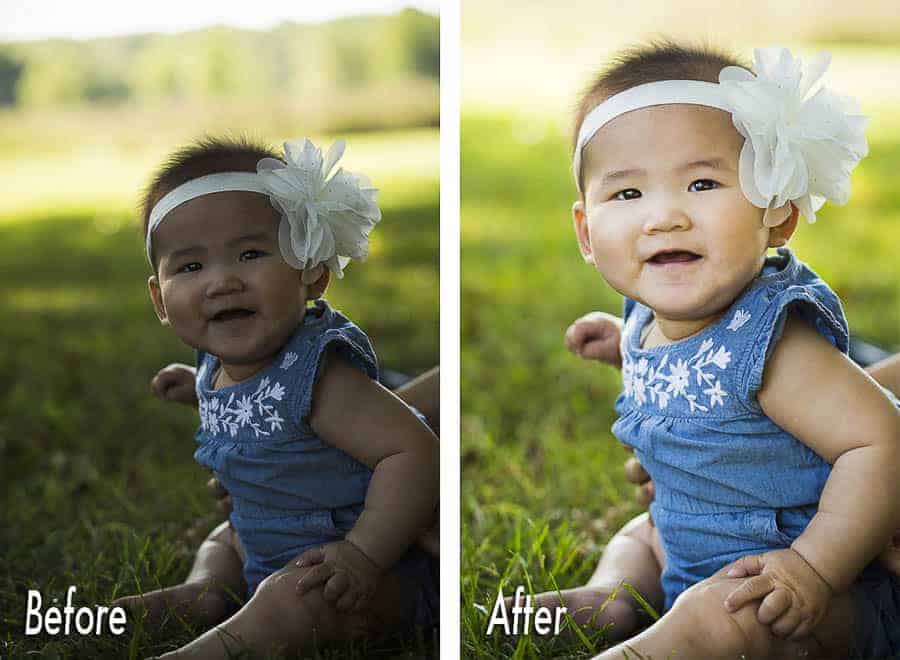
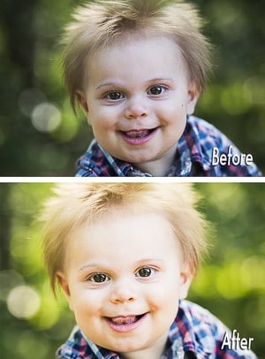
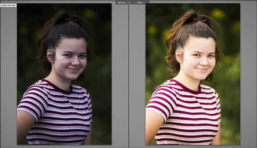
Take a look at the before and after below. With experience on my side, I made all of those changes and transformed a decent image into something great in about three minutes. Lightroom is a powerful program. With practice and time, you can use Lightroom to develop truly amazing portraits.
For tips on exporting, listen to these episodes Jeff Harmon’s Photo Taco podcast. Export for Printing. JPEG Compression Levels.
Thanks Aaron, some very useful and well thought out tips, and it was well worth the read.