
5 tips on how to turn otherwise dead or lackluster photos into brilliant photos that come alive using luminosity principles from the masters.
I know the feeling. You’re excited about being a photographer. You might even have dreams of being a professional. You just spent $1,500 on a camera and lens. With anticipation of greatness, you go out shooting. But the photos come out boring. They’re drab. You’re embarrassed to tell anyone you spent $1,500 on gear to get results like this. You see 12-year-olds posting better iPhone photos on Facebook.
You have two options:
- Run back to the store and return your camera; or
- Remove all distractions, close your door, and play close attention to what I’m about to tell you. It might transform your photography.
Are Your Photos Dead?
Photography is all about light. When your images exude light rather than just reflect it, they come alive. That is luminosity. It grabs your attention and says LOOK AT ME! To achieve this, conventional wisdom says to increase your saturation and make the colors brighter.
Well guess what? Conventional wisdom is dead wrong. That advice will not give you increased luminosity. It might help but they might do more harm than good. “Says who?” A bunch of dead painters, that’s who. You know, the ones who created masterpieces worth millions of dollars. Painters like Van Gogh, Renoir, and Monet. Some of the greatest masters of art. I know they weren’t photographers, but if they were alive today and shooting photography, I’d bet their approach to color would be the same as it was when they were painting.
Their use of color was revolutionary. People loved it. And they still love it. “If it ain’t broke, don’t fix it.” And I assure you it’s not broken. A Monet painting, Nymphéas, this summer sold for $55 Million USD.
Below are five tips I have learned from my study of Monet and Van Gogh. Use them to elevate your use of color and bring new life into your photography:
Tip 1: Color “Hacking”
The Impressionists like Monet were masters of color theory. And though there are many facets of color theory, they put more emphasis on one facet than any other: Complementary Color. Complementary color is a color scheme that utilizes colors that are opposite each other on the color wheel. Take a look:
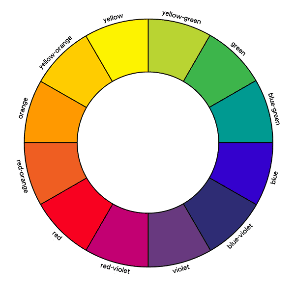
Look at the color orange. You see directly opposite orange is blue. These two colors are often used together, and for good reason. One thing that you learn in color theory is that warm colors advance and cool colors recede. That’s part of the magic in using colors like orange and blue together. The orange pops out at you when set against a blue background. Here is an example from Monet, creating luminosity with the use of color theory:
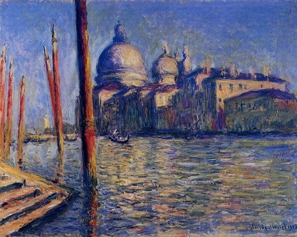
Here he uses a saturated blue and a somewhat desaturated orange. And he also uses red and its desaturated opposite, green. Simple technique, masterful effect. It is one of my favorites of all time for its sense of luminosity.
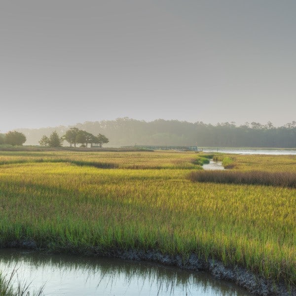
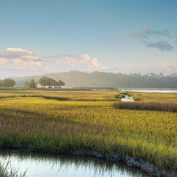
And this approach to color can be incorporated into photography. Here is an example from my portfolio that uses orange and blue almost exclusively:
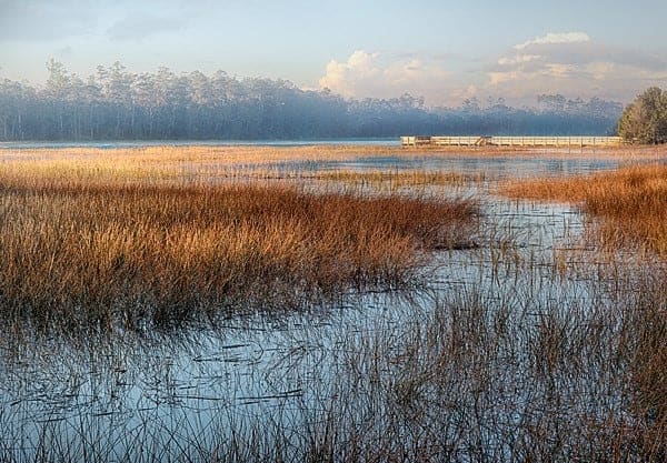
I adjusted my oranges and blues in Photoshop to make them opposites and even added some blue to the shadows in the distance. The warmth of the grasses have much more luminosity than they would have if there wasn’t the blue water to offset it.
Tip 2: Selectively Saturate
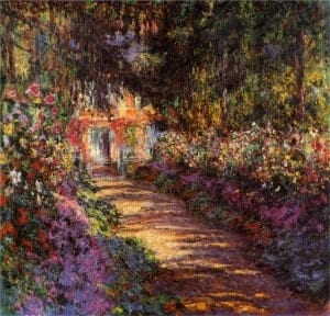
Too often photographers, in order to accentuate their colors, saturate everything in the image. But Monet teaches a better approach. You get a hint of it in the painting above. Here is perhaps a better example of creating a glowing luminance, a painting of his garden path at Giverny.
The great sense of light was created by using warm colors of orange, yellow, and red, and surrounding them with darkened and desaturated shades of blue, green, and purple.
Below are two instances of the same photo from Pamela Butler-Stone, showing how a photo can be edited using Monet’s advice on color. The unedited version of the photo suffers from the bright vibrant green. It competes with the flower for the viewer’s attention. The flower doesn’t stand out.
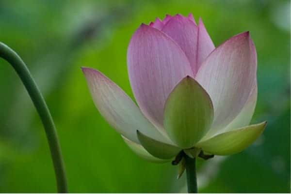
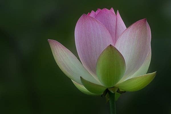
The flower in the edited version looks more luminous, but it wasn’t changed at all. The apparent change is an illusion created by the desaturation and slight darkening of the vibrant background. The yellow-green and red-violet now work together in a harmonious way, and the red-violet color really pops off the page.
So remember, be selective about what you saturate.
Tip 3: Brightness Deception

The above color chart shows various shades of red from very dark to very bright. The fifth square represents red as it would be photographed at a normal exposure. And that is when you see the full intensity of its red hue.
Do you see what happens to the darkest shade of red? You can’t even tell that it is red. It looks brown. And the brightest square on the far right looks like a pale pink. Bottom line: if you darken or brighten a color, its hue becomes weaker.
Do you want to know how to preserve the red and at the same time present it as being brighter? Monet demonstrated this with the sun in his famous painting Impression, Sunrise
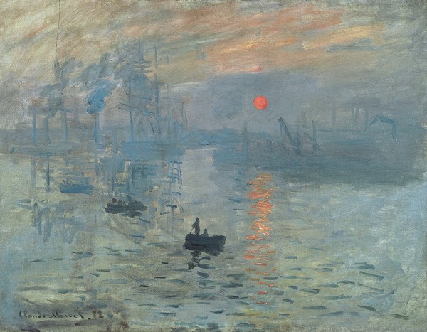
The sun appears much brighter than it actually is due to the context of where it is placed in the painting. And the cool color of the sky contrasted with the orange-red sun, gives it the appearance of being darker than it is.
In fact, it is possible to have one color appear as a brighter color without brightening it all, as these two samples created by R. Beau Lotto of Lotto Labs illustrate:
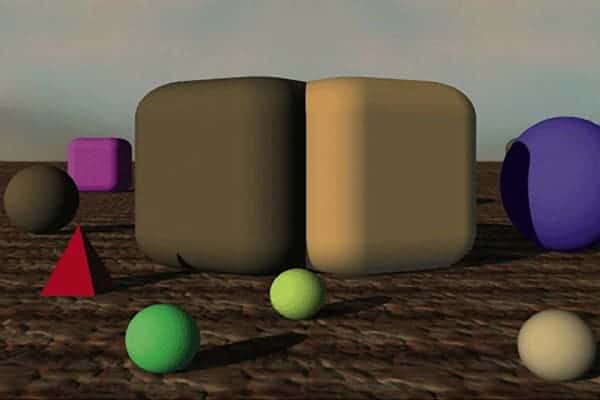
The two large surfaces in the foreground appear different from each other: Brown on the left and beige on the right. But despite these appearances, the square center areas of the surfaces are physically identical. They have the same hue, same brightness, and the same saturation.
This example illustrates that the color and the luminosity perceived may in fact be far departures from their actual values. The illusion was created by the surrounding colors and luminance levels. Here is another example from Lotto Labs that illustrates that:

The central squares on the upper and lower surfaces of this cube appear very different in color: Brown on the top and glowing orange on the bottom. Look at the masked version of this image (concealing the surrounding color and light) and see that they are indeed identical. Monet understood this type of illusion. He knew how to make colors glow by changing the values of surrounding colors. And that has relevance in photography, too.
As photographers, we don’t have to brighten our colors to create brightness. For as you saw in the red color strip example, that would rob us of color. We just have to know how to use it.
Tip 4: Ignore White Balance (Sometimes)
White Balance: A rule so ingrained in the consciousness of photographers that digital cameras have a built-in mode, AWB (Automatic White Balance) to help them not break it. This rule mandates that photographers photograph scenes with a neutral color balance. That is, neutral tones like white and gray are reproduced without a warm tint towards yellow or a cool tint towards blue.
If you are shooting indoors and there is a lot of incandescent lighting, AWB will correct for the yellow cast of the warm light source. And yes, that is most often what you want because that will look most natural. But it is not always what you want. For instance, you might want a room filled with the warm glow of a late afternoon sun. When the warmth or coolness of a light source and its reflection are important to the mood of a photo, you want to capture that warmth or coolness. As an artist, it is your job to determine when that is.
Here is a painting by Van Gogh, Café Terrace on the Place du Forum.
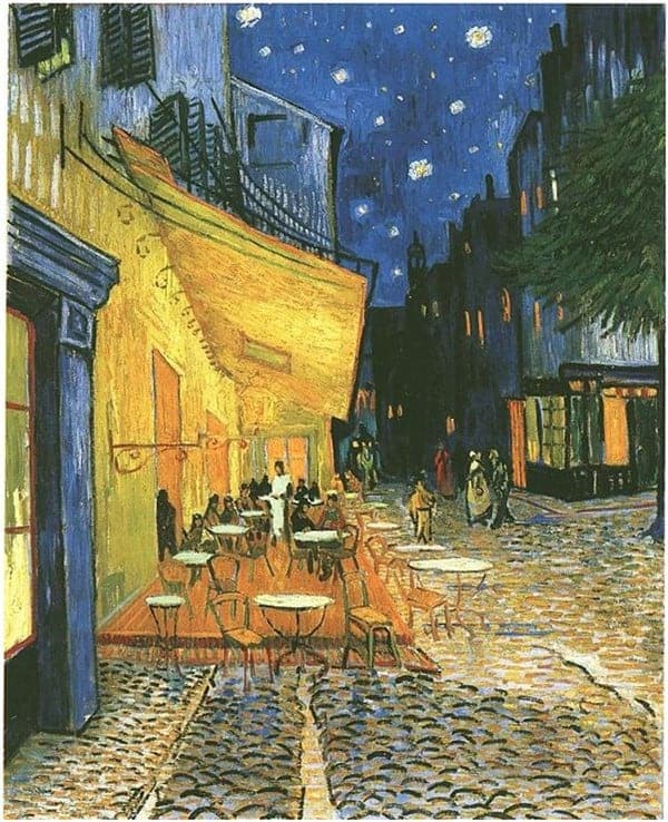
It’s a nighttime scene that he painted at night in order to capture the nuances of the warm colors of the café’s lights contrasted against the coolness of the nighttime sky. But what if he was a photographer, using a gray card to get the white balance just right? It would have created a vastly different viewing experience. To Van Gogh, it was all about the light, so he suffused his painting with the color of the reflected light – yellow, orange, blue.
You see these shades in the cafe, but also in the windows, cobblestone and small patches in the sky. Not only does this add to the emotion of the painting, but this contrasting of warm and cool colors (by forgetting about white balance) create what we are striving for: luminosity. Van Gogh’s good friend and colleague, Paul Gauguin referred to Van Gogh’s approach to color as the inner force of his art. So why not bring that inner force to your photography?
Here is a photograph of mine where I used the warmth of the evening sun in a bedroom. I sacrificed the accurate color of the room and its furnishings for the accuracy of the warm light source – the late afternoon sun.

Tip 5: Depart From Reality
It is understood that painters will exaggerate or alter a color in a scene. It’s what artists do. They visualize, and they express that visualization in the painting. Consider the case of this painting, The Sower, another painting by Vincent Van Gogh:
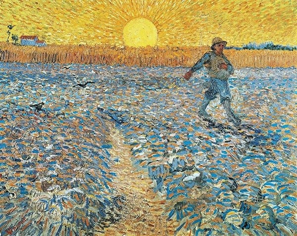
As far as paintings go, it is not too abstract. But why is the foreground blue? Van Gogh said he couldn’t care less what the colors were in reality. He used the colors that would create the most impact for his viewers.
Before digital photography, there was not a lot a photographer could do to change color in a scene. If you photographed a red car, you were going to have a photograph of a red car. But now you have a choice. That red car can be any color you want. And that is important, not because we crave variety in our colors, but because some colors in our photographs work more effectively than others.
Some photographers are reluctant to change color. They don’t want to depart from reality. But what is more important, staying true to a washed out sky or impacting a viewer’s emotions? True artists aren't afraid of departing from reality. They seek to leave an impact. They live for those moments when someone looks at their photography and says “Wow!”
Here is an example of my work departing from reality, with both the unedited and edited version:
Notice that besides changing the sky, I changed the color of the grass in the foreground as well as in the distance. I desaturated the dark greens, and added yellow’s complementary color of purple to some of the shadow areas. The final result has much improved luminosity.
Why do all this?
I know why I do it. I want my photography to have as big of an impact on the viewer as possible. I like it when people come up to my work and I see their jaws drop. I like it when I see people standing in front of my work and it causes enough emotion to talk about it with others.
So go for it. Get people’s attention with your use color. The great painters did. They didn’t use random colors on their paintings, and as a photographer, you don’t have to either. What do you think would happen if you started paying as much attention to color in your fine art photography as Monet did with his paintings? I’ll tell you what: your photography will evolve to new heights.
It comes down to one question: “Why do we create photographs?” For me the answer is “to get a response.” The greater the response the better. So take the time and implement these tips. When you’re done with the image, you will be inspired to create another. Artistic inspiration is what leads to masterpieces.
This article was guest contributed by Greg Butler
What a FANTASTIC article!!! You made excellent points with reinforcing examples that I found so helpful. Thank you for sharing these points and ideas.
Thanks Lori. Simple principles can make a big difference. Good luck.
Great presentation Greg, I want to hear more from you in the future! I will be thinking differently as I go forward.
Thanks Mark. I’m glad you find the information useful. I think the main point is to be aware of how the colors interact with each other. If in a negative way, minimize it. If good, maximize it.
This is a “brilliant” article, Greg. Your examples complement your points very well and really make the article special. Well done.
Thanks Steve. I hope you are able to benefit from it. Color and luminosity are key to great color photography. I’m glad you liked the examples I used.
Wonderful article!
Thanks Diane. I’m glad you liked it.
One of the most original and insightful photography blogs I’ve read in a long time. I look forward to trying to find ways of applying these tips in the months ahead!
Thanks for the positive feedback, Alistair. Good luck in your photography.
Great tips!! All of this talk about painters reminded me of this documentary of Johannes Vermeer. People for years were perplexed by his paintings because he painted like how a camera sees light, not like a human eye sees light.. This guy Tim (who’s brilliant BTW) set out to try to replicate a Vermeer painting how he thinks he did it..
Its an amazing documentary.. here’s a link to the trailer for whoever is interested.
https://www.youtube.com/watch?v=94pCNUu6qFY
Thanks Eric. Yes, I saw the documentary. Amazing. What an artist!
Greg,
I have taught visual art for 25 years. The examples you gave and the ideas imparted were spot on. I do believe that many people that do not have any training in color theory often struggle with the question of “what’s missing…” When they look at their photo and know something could make it very special. Great read
Hi Kim,
I’m glad you enjoyed the read. Thanks for your positive feedback. Yes, the treatment of color is often the piece of the puzzle that is missing.
Thanks for the tips. It’s not that often to read something new and inspiring, away from the pure technical staff. In my opinion the last edited photograph brings different emotions, therefore the unedited one could be equally attractive depending on the mood of the observer.
Hi Ivo,
I’m glad to hear that you found it inspiring. I tried to bring something to the subject that was unexpected and new. And thanks for your feedback on the last image.
Quite an inspiring article Greg!
Wow! Thanks Joseph. I like nothing better than inspiring people. Glad you liked it.
I love what you have done to ,accentuate coolers in your photos . Would it be possible to present with some video instruction using your Colorado theory in practice
II you take up this challenge , for me at least , using Lightroom will be a great advantage.
Also where exactly were these wonderful photos taken?
Sue
Hi Greg,
Congratulations on winning the SBO contest! Your post shows why – clearly. It is fantastic writing, with obviously awesome research and mastery, that draws you in. There is something in it for everyone.
Chapeau :-]
Beat
Thanks Beat. Liz, one of Jon Morrow’s editors from the Guest Blogging program, really helped a lot. Jon and his team are the best.
Thanks Beat. SBO is quite helpful. Jon is awesome.
Nice post, thanks for share.
I love tip2.
Thanks Led. Thanks for sharing.
Awesome… I never what was the thing I was missing not even the photos dead. Now, I understand from you that what was really missing… I am a beginner and your points helps me a lot in realizing what makes a photo… Thanks
Hmmm… when you say color, do you mean colour…??? Ha, ha… 🙂
Greetings, and thank-you for the guidance, from New Zealand.
LCJ
Yes, it’s true. Why do we take pictures? Thanks for sharing.
Excellent post! Thanks especially for sharing non-edited and edited versions of your own photos – many of us are, after all, visual learners!
Great article Greg! Appreciate your posting the before and after images !!!