
Perfecting your photos during post processing is an important final step of photography. Some photographers choose to only make minor adjustments to exposure and contrast and others do extensive editing with exposure brushes, curves, selective saturation adjustments, and even compositing in Photoshop. Whatever your editing preference, there are a few editing mistakes (or oversights) that I often see when looking at a landscape photographer's final product.
In this article, we'll discuss the common mistakes I see how to correct them. I'm not immune to these mistakes myself, I've noticed them in my final prints, sometimes it has taken a couple years hanging on my wall to see it. But if I can help you catch it during your post processing workflow, hopefully you can avoid making the mistakes permanent in an expensive print.
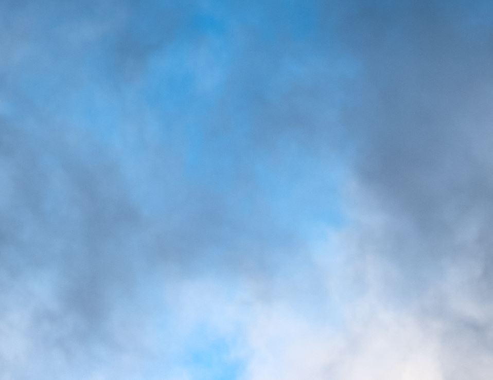
Crunchy sky
This tops my list because it is the most commonly overlooked post processing step that I see. When you make adjustments to the sky (usually dropping the highlight slider to -100 and using the exposure brush), it will lead to a degradation of the pixel density. This causes the sky and clouds to look waaaay over sharpened and super crunchy, even though you haven't touched the sharpness slider at all. The reason, I think, this goes unnoticed is because many times we are not zooming into our photos to view them at 1:1 ratio. It looks fine when viewing the full image because everything in compacted and visible mistakes are minimized.
I only started to notice this when I had to zoom in to make sensor spot corrections and found that my sky was really crunchy looking. Then I began to notice this on almost all my landscape photos. If it goes unchecked, it can show up in prints, especially when printing large photos (larger than 12×18) and could ruin your photograph.
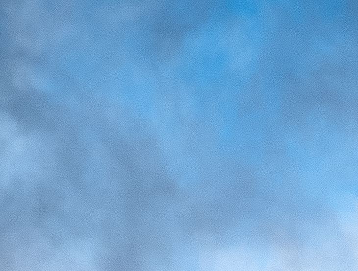
This is easy to fix. Simply mask out your sky and apply a little bit of sharpness reduction (move the slider to the negative) and/or noise reduction (move the slider towards the positive).
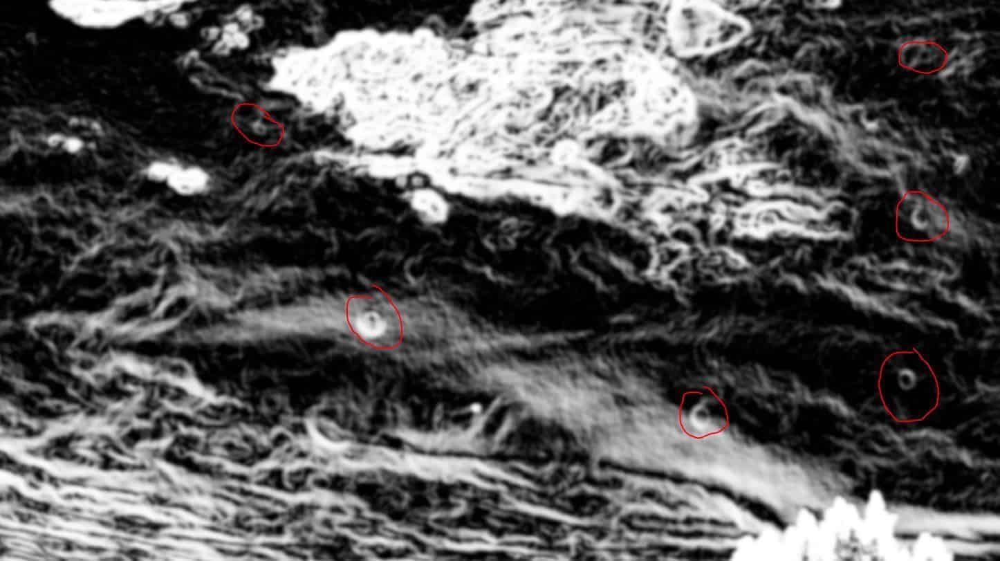
Sensor spots and distracting elements
Speaking of sensor spots, another often unchecked post processing step is correcting sensor spots. This is caused by dust or grime on your one of your lens elements or your sensor. No matter how clean I think my sensor is, I'll still see a sensor spot here and there. Sensor spots show up as small circles of fluctuating exposure. They can either be abnormally bright or dark spots on your image. You'll usually notice these in the sky but can also see them in the foreground.
To fix these, simple select the spot removal tool in Lightroom (the circle with the arrow coming out the side) and then click on “Visualize Spots” checkbox in the bottom left of the screen just below your image. This will give you a high contrast, black and white view of your photo where you can easily see these spots. They will look like little crescent moons or oblong circles. Adjust your brush size to match the diameter and click on them. I like to have about 35% feather and I set my brush to “heal” instead of “clone.” I think it produces better results.
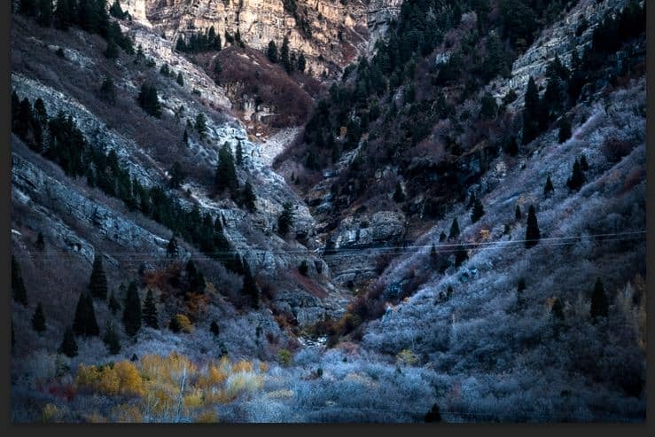
Other distracting elements are usually found the backgrounds of your images. This includes people, animals, trash, signs, construction equipment, lightpoles, telephone wires, and random debris. Even if the distraction is part of the scene you are photographing (telephone wires, for example) I don't see a need to include them in a scenic photograph. People like to feel immersed by nature when looking at landscape photos, and man made elements can pull them away from that. You can use the spot removal tool for very simple distractions, but for more complex items, you'll have to import your image into Photoshop and use the clone stamp for a really good removal.
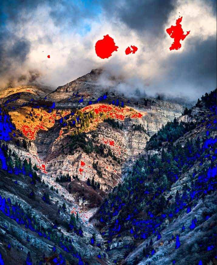
Blown out highlights and lowlights
Sometimes we tend to go a little overboard with our editing and push things a little too far. Blown out highlights and lowlights (blacks) are very common and hard to notice during your editing.
By simply hitting the “J” key in Lightroom, you will enable the White/Black clipping mask. This will show you the blown out whites (in red) and blacks (in blue). You can selectively adjust these with an exposure brush or make universal adjustments with the white and black sliders. For me, I tend to like having brighter whites and darker blacks as an overall element of my photos, so I will make local adjustments with the brush if I see this in my photos. Also, depending on the scene you are trying to create, a little bit of clipped whites or blacks might not be a bad thing. Don't think that your image is ruined if you see a little bit of red or blue when you turn on your clipping mask.
Tilted horizons
Another common error is the tilted horizon. This happens quite often when the photographer is shooting a scene with a wide lens. The distortion of the camera causes some elements of the photo to look straight up and down but the horizon is slanting to the left or right. Sometimes it is hard to notice a tilted horizon because there is either no clear view of the horizon or there are so many leading lines that the horizon is of little consequence.
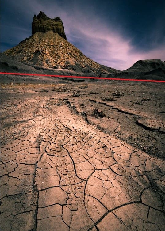
If you noticed a tilted horizon in your photo, it is usually easy to fix by simply rotating the image a bit. If you have significant distortion because of your lens, you can import your photo into Photoshop and use the “Warp Transform” tool to make local adjustments to different ares of your image so you can lift up the right side while leaving the left side unaffected. This has usually worked when rotating the image will negatively affect the overall scene.
Over saturation
While being more common with beginner photographers, saturation is something of a personal preference. Typically, you'll notice that images posted to the Internet by amateur photographers are over saturated or have too much clarity added. My personal belief that causes this phenomenon is because in the day we live in where you get 10 seconds of fame on 500px or Instagram, you have to be visually striking. Over saturation usually catches people's attention who are only looking at a photograph for 10 seconds or less, long enough to give it a thumbs up. Amateur photographers sometimes resort to over saturation to compensate for a lack of skill in other areas of photography (like composition, color theory, or emotion). However, oversaturated photos are like eating too much sugar. The first couple of bites are fine, even exciting. But soon, you get tired of eating it. With photos, the first couple of views are great, “Wow, look at this amazing photograph!” But you get tired of looking at it after a while because you start to realize how unnatural it is. You'd never want to hang it on your wall. If you look at the photos from experienced landscape photographers, you'll see that the colors aren't super sugary. Compared to most of the photos on 500px, they are rather bland. But these photos from photographers who have 10 years of experience are the ones that people buy and hang on their wall. They are pleasing to look at for years, even decades.
Overbrushing
Another common mistake for beginner photographers. The exposure brush in Lightroom is a fantastic tool and can be as precise as a sledgehammer or a scalpel, depending on how you use it. Most often, the tops of trees, hills, buildings, and mountains are clipped when brushing along the sky. Similarly, elements you want to bring attention to can be overbrushed, leading to exposure halos which we'll talk about next.
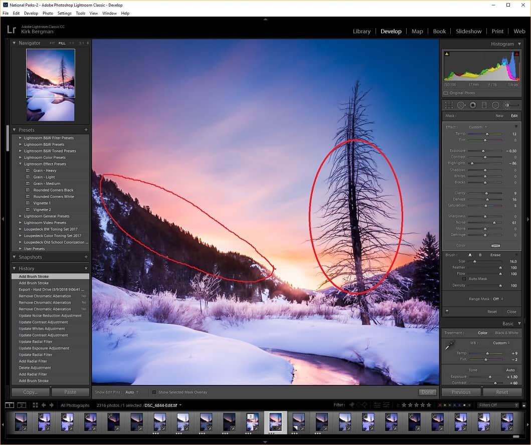
To fix overbrushing, there are simple tricks you can learn about how the brush tool works in Lightroom and how to manipulate it to do what you want.
Exposure Halos/chromatic aberrations
A common side effect of overbrushing is the creation of exposure halos around the subject you are brushing. This is very common when trying to brighting up a subject that is located in a dark part of the scene, or when there is high contrast against the subject (when it sits against the sky, for example). Exposure halos are so overlooked, you'll start to notice them everywhere now that I've brought them to your attention. Hopefull, you can avoid this common mistake by double checking your editing and making correct exposure adjustments in the first place.
Exposure halos are easy to fix by making sure you aren't overbrushing. See the link the previous section to learn how to control your exposure brush in Lighroom.
Chromatic aberrations are another common mistake that is easy to fix. You'll usually see these in the form of purple or green hued shading along the edges of tree branches, rocks, or other landscape items that intersect or are adjacent to the sky. Fixing these is easy, just check the “Remove Chromatic Aberration” checkbox in Lightroom under the Lens Corrections section of the editing panel. 90% of the time, this will do the trick. You can bring your photos into Photoshop and use the clone stamp tool to make further corrections if you need.
Conclusion
Improving your editing is usually a journey of discovery. Discovering what you are doing, what mistakes you've missed, how to fix them, and how to prevent them in the future. I have a mental checklist of items to go over when I edit my photos that include checking for sensor spots, viewing the overlay on my exposure brush, scanning for distracting elements I didn't notice on scene, and taking some of the noise out of the sky. Hopefully these tips can help you make your photos just that much better. Let us know if you notice any other mistakes you commonly see in other peopel's photos.
Thanks a bunch, really helpful tips
Excellent article. Thanks for sharing the information.
Great article, thanks. I see a lot of mistakes in my photos now that I am looking at them at 2:1 instead of 1:1.
Amazing Article……
Great article. These are mistakes that everyone has been guilty of!
The tilted horizon is especially annoying – Once you notice a horizon is off you can’t unsee it!
Useful article – thank you.