

Space is one of the primary design elements in art (along with line, color, form, shape, texture and value). The thoughtful use of negative space can add another dimension to your photography. In this article, we’ll explore negative space, what it means and how we can best use it.
Positive & Negative Space
If there’s a negative space, then there must be a positive space, too, right? Understanding the positive helps us understand the negative. Positive space is most often the subject of your photo: the eagle in flight, the mountain, the flower, the person. Positive space is the extrovert, pushing forward, trying to grab your attention and saying “Look at me! Look at me!” It is what draws your eye, the star of the show.

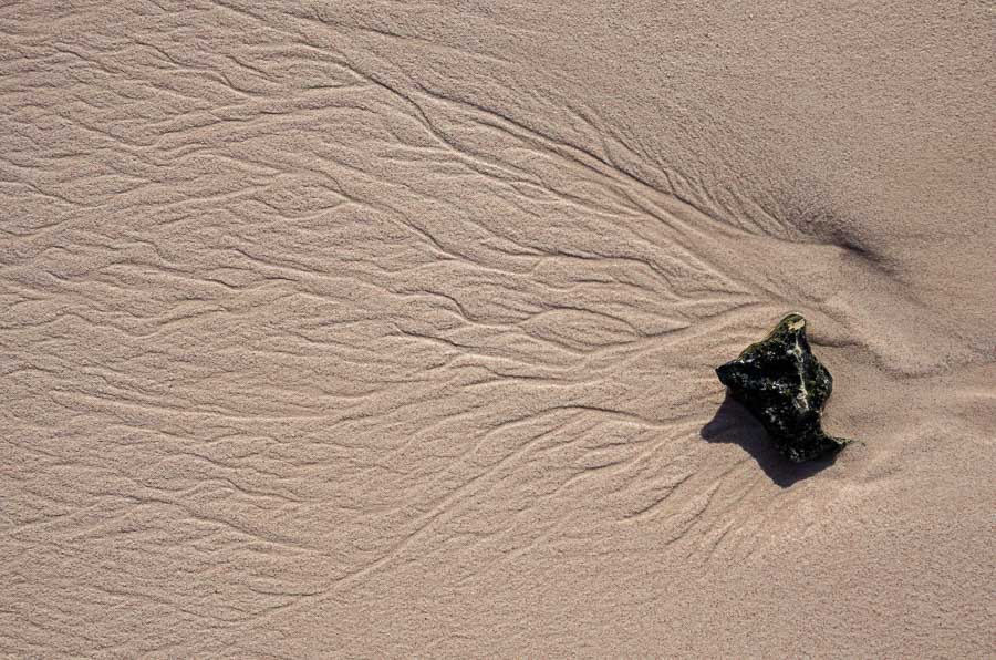
Negative space is the introvert. It’s shy and wants to fade away, inconspicuously, into the background. It doesn’t shout for attention. It might be the snowbank through which a single tuft of grass (the subject and positive space) protrudes. It might be the sky around that flying eagle, a monochromatic wall behind a person, or the sand on a beach surrounding a rock. In the image above, it's the sky around the subject of the dead tree limbs. Negative space may be all but invisible, yet it plays an important supporting role by isolating and drawing attention to the subject, providing mood and giving the positive space/subject room to breathe or move.
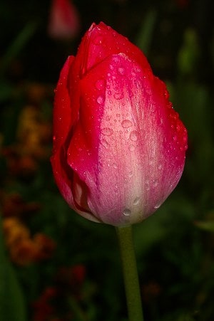
Negative space doesn’t imply that it’s empty space. Nope! The sky around the eagle can contain clouds. A wall can have color and texture. The bokeh of your lens at f2.8 can create a creamy, soft and colorful negative space behind a close up of a flower or a macro shot of a dragonfly.
Positive space isn’t necessarily better than negative space, just different. It would be hard to make a compelling image with just one or the other yet, together, they make a powerful combination. Without a pleasing balance of positive and negative space, you can wind up with images that are busy and confusing, or desolate and lonely.
Negative Space is Everywhere
Graphic designers use negative space all the time, often to provide a subtle reinforcement of their point. Take a look at the FedEx logo. The purple and orange letters are positive space, bright and colorful. They appear to be advancing off the screen or page. They’re in your face. The white background is the negative space. It helps the letters pop out. But look closer! The negative space between the E and the x takes the shape of an arrow, conveying a sense of movement and speed. The negative space makes the logo’s letters stand out and sets an energetic, forward-looking mood.
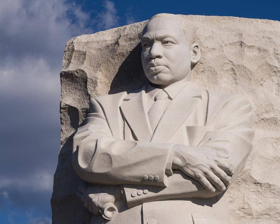
A sculpture is positive space surrounded by negative space. Negative space gives it form and volume. The furniture and decorations in a room are the positive spaces to the negative space of the walls and floors. In a well-designed house, they work together to establish harmony. Once you start looking, you’ll see examples of positive and negative space everywhere you look!
How can we effectively use negative space in our photography?
Four Ways to Use Negative Space
1 Isolate and draw attention to the subject
The most common way to use negative space is to emphasize the subject, the positive space. The empty sky around the flying eagle draws your eye to the bird. The blank wall behind the walking man brings the focus to the pedestrian. The background in a portrait isolates the subject. The blurred background behind the flower makes the bloom stand out.
In each case, the negative space focuses attention on the subject. It makes the subject pop out of the frame, while the negative space recedes into the background.
Negative space gives the viewer room to imagine. What is that person looking at? Where is she going? Is the soaring eagle on the hunt? What is the running wolf about to do? What's behind that flower?

2 Set an emotion or mood
Often, negative space creates a sense of calm, order and quiet by removing distractions. However, using bright colors in negative space can give a sense of energy and vitality.
There is a whole field of color psychology studying people’s emotional reaction to certain colors. The warm colors—reds, oranges, yellows—can trigger feelings of warmth, excitement, danger, romance, passion and anger. Cooler colors—blues, greens, purples—generate feelings of coolness, calmness and sadness.
So, the pedestrian striding across the frame in front of an orange wall gets a sense of energy from his pose, but also from the color of the background. Orange is associated with energy, excitement, enthusiasm, stimulation and warmth.
Someone sitting against a blue wall could evoke a sense of calmness and serenity or of coldness, sadness and loneliness.
A subject set in a lot of negative space can seem lonely and isolated, but with too little space can seem claustrophobic.

3 Simplicity or minimalism
Creating negative space by the way you frame your shot, by your aperture and bokeh, your use of lighting, can all help simplify a composition. Imagine yourself in a field of blooming wildflowers. It’s a chaotic mass of contrasting colors. How do you make sense of it all?
Framing a single flower, with your field of focus falling off rapidly behind it, and the background falling into shadow, takes the messy scene and distills it down to a single bloom.
Product photography, where the item appears on a field of white, is another example of a minimal approach, where the use of negative space simplifies the composition and amplifies the attention on the product.
4 Room for text
If you’re thinking of putting your images up for stock sale, know that negative space is particularly important to buyers. Negative space is where they put the text of their advertisements, the title of their magazine or the headline of their article. The words need some room to breathe. Just as sufficient white space in text enhances readability by making the text appear less dense and more inviting, some space around a text block in your image allows it to feel more open and attractive.
Three Cautions
You’ve heard of the Three Musketeers. The Three Cautions are their less adventurous associates.
1 Is there enough room to move?
Our eyes are very good at following implied direction. If your subject is moving or looking in one direction, there must be enough negative space for the viewer to imagine that movement or gaze.
Consider a person on a bicycle moving right to left. If she is positioned in the right side of the frame, there is plenty of room for her to move into, and the viewer is comfortable imagining her journey. If she’s placed on the left, she’s too close to the edge and the viewer feels uncomfortably constricted. There isn’t enough room to imagine her to movement.
Think of a portrait in profile, with the subject looking towards the left. We need space to imagine what he’s looking at. Place the subject too close to the left edge and it feels like his gaze is being cut off.
2 How much negative space is too much?
If you can have too little room to move, you can also have too much negative space or have it in the wrong places. It doesn’t do you much good to have a lot of negative space behind that bicyclist or behind the back of the head in that portrait. It doesn’t work if there’s too much negative space in front. Unless you’re trying to make the subject look small, lonely and insignificant, you’ll want to limit the amount of negative space.
There’s a rough rule of thumb that your negative space should be more than your positive space. How much? Up to about double. Beyond that, your subject starts to be diminished. Somewhere between equal amounts and double should net you a pleasing ratio.

3 Are you being purposeful?
When you’re fixated on a subject, it’s easy to forget about the background and the negative space it contains. When you’re focused on trying to capture a moving object, like that flying eagle, are you paying attention to the background so you don’t wind up spending hours cloning telephone wires out of your image? Is the grazing buffalo set off by the white snow or does it blend into the woods behind it?
As you’re composing your shot, stop to ask yourself how and why am I using negative space? Is it to establish a context and setting or to remove them from the shot? Is it to isolate and emphasize the subject or to diminish it? Is it to create an emotion or sense of movement or wrap your subject in a shroud of mystery?
You have to be purposeful in the use of negative space, if you want it to play its supporting role. For every Oscar going to the star of a movie, there’s also one for a supporting actor. The film wouldn’t be the same without the supporting actors and your photography will be less than it could be without the supporting role of negative space.
What are your favorite ways to use negative space? Drop us a line in the comments!
For the most important site to be play free games mahjongg dimensions.
Author definitely inspired by “Origin” of Dan Brown: FEDEX on negative.