
This is the second part in a part two in composition. If you haven't read it, go back to my first article “Understanding Composition in Photography: a Complete Guide” to see the first half of this conversation.
I will be honest color theory is hard for me. I mean really really hard.
I am color blind.
According to Enchroma, I am moderate protan. This means I see plenty of color, but I struggle with reds and greens and purples. So yeah I am a photographer that is color blind and am here to talk to you about color theory. But I can read and apply what I learn and ask my wife to make sure I didn't screw up. Let's get into the meat of things.
What is Color Theory?
Color Theory is the concept that colors work with each other to produce different effects. Color can combine to either create different feelings, moods, and meanings to your photographs. If they are combined appropriately they will cause your images to have greater pop and impact. If they are mixed incorrectly they will create chaos and an all around poor image. This is why you need to pay attention to this in your images.
Primary Colors
There are three primary colors: Red, Blue, and Yellow. These colors can be combined in an any arrangement to, in theory, create any other color.
Mind you, all these things are important but not actually what I am wanting to talk about today. In photography we are wanting to work with how colors interact with each other. When I take a photograph, I don't think about how my primary colors are represented, but what I do pay attention to is the colors and how they play out on my digital canvas. In order to talk about this, let me introduce a color wheel.
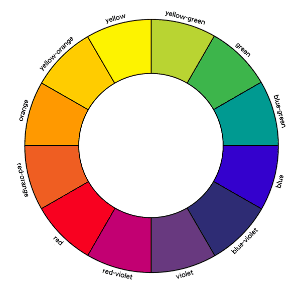
The Color Wheel
The Color Wheel is a simple way to visualize how colors interact and how they can be used to improve your images. As you go around the wheel you will see how colors relate to each other. In this color wheel scheme, the primary colors are Red, Yellow and Blue. Your secondary colors are Violet, Orange, and Green. The colors that are between show how these colors were mixed to create a different color. Not complicated, but important to visualize. (Remember I am color blind, so I never grew up being able to easily visualize these relations. And since it is estimated 8% of males are color blind, I figured this would be good to throw in.)
Color Schemes
What I mean by color schemes is actually color arrangements that are particularly pleasant to see. The advantage for us is that in nature there are plenty of these occurring naturally so we don't have to work too hard to pull them off. But being mindful of them is important for your photography so let's break them down and show some examples.
Complementary Colors
complementary colors are those colors that are opposite of each other on the color wheel. If they are next to each other on your digital canvas they have extra contrast and thus they have more pop. If they overlap the pop is even more apparent. Lets see an an example of this.

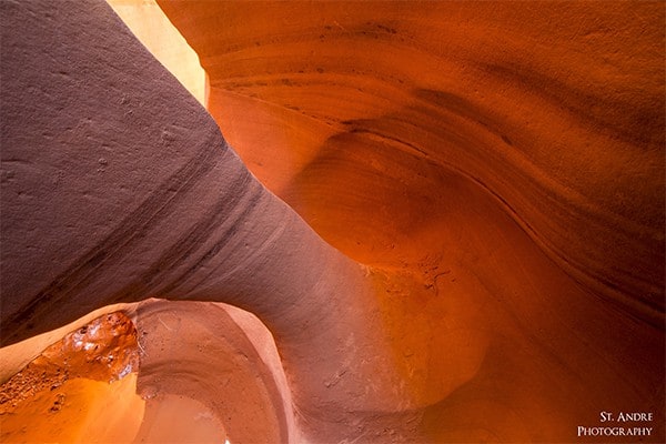
This is an example of how I subtly used the color scheme of the photo to add additional pop. If we look at the color wheel above we can see that blue and orange are complimentary to each other other. When I made this image, I added additional contrast to the sky which makes it more blue. That touch of blue causes the oranges in the arch to be even more bright. If I wanted to increase the saturation of the sky (I think vibrance slider would actually do a better job, but that is a hunch) there would be even more pop to that orange, but since I wanted to stick to a natural look I didn't add any more.
This is a simple example of how complimentary colors are to be used. If you can bring them together in an image, you will produce more appealing images for your audience.
Analogous Colors
Analogous Colors are colors that lie next to each other on the Color Wheel. When used it will create a color scheme that is well balanced and flows easily. They also play off each other and enhance each other. In the example below, I try to focus only on shades of oranges, yellows, and red. Since these colors are next to each other the image feels balanced. Mind you the actual composition of the image is kind of bad, thus it never made it to my website.
Triad Color Scheme
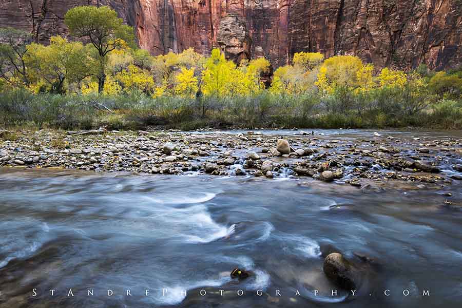
This is where you three colors that are equal distant from each other. To use a Triad color scheme try to find compositions that have equal distant colors from each other on the color wheel. Mind you this may seem difficult, but the more you think about it in your images in post process you will see it. In the example below I have a red, yellow, blue compliment going on. Red for the red rock at the top of the image, yellow in the fall foliage and blue in the water. In order to pull off this image better I added a bit of blue to the water so that it would give the yellow a bit more pop and finish off the color scheme.
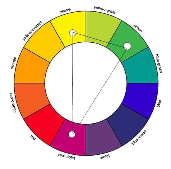
Split Complementary
Split complementary color schemes are created with a compliment color scheme but using two adjacent colors rather than the compliment base… So in other words if you have blue and orange as a complementary color scheme you would then just use blue and red orange and yellow orange. The little thumb nail below shows another example visually. Split complementary add additional pop to your images because you are working with complements but with a larger array of color. I have a hand full of images that use this very well thus they have been great sellers.
Some Wrap Up
There are other color schemes out there that can be looked up, but I feel like these are the most useful for landscape photographers (this is subjective). See, the challenge when you are photographing nature is that you can't control all the colors in it. Unless you are heavy editor like Ryan Dyar, you will probably use just what you have on the screen. By the way, this is not a bash on Ryan. He is a fantastic photographer and editor. I love his style, and I use it on occasion, but it is a style of a digital painter.
The Meaning of Color
Let's assume you are wanting to decorate a home, or create a color theme that comes across telling a story. Understanding colors and their meanings can do just this. If you are placing images into a doctor's office, you might want to use cool blues greens and yellows rather than using deep reds. There are reasons to this. Our body actually reacts to different colors and since it does you can use it to create a better story.
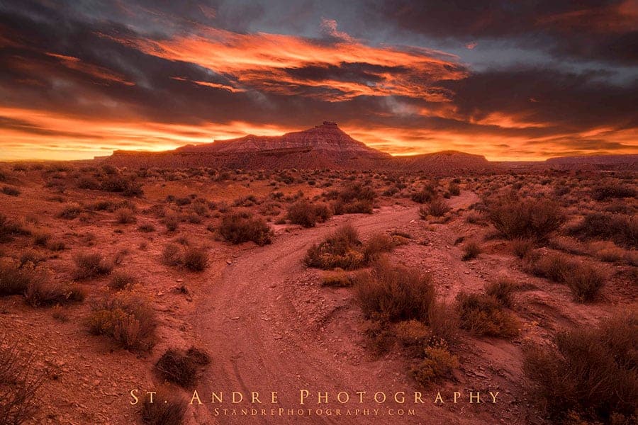
Red– conveys blood, fear, anger, passion, love and lust. People react quicker to red than any other color. This is why red draws so much attention in photographs. If you are wanting to tell a story and you want the most important thing to be highlighted, try to make it red. The image below is an example of red and how it affects the viewer. I took this image a few days ago during what was an epic sunrise. Because there was so much red in the sky it created a color cast on the entire landscape. This color cast causes this image to feel ominous and even somewhat dangerous. As Legolas from Lord of the Rings said “A red sun rises, blood has been spilled this night.”
Orange– Orange combines a few things. It has the joy of yellow while also carrying the passion of red. This makes a combination that is both warm and happy. Orange does not bring fear but happiness to an image. This is what makes red rock such a great subject when the right light goes across it. It creates a warm happy feeling that is also intriguing and powerful.
Yellow– This is generally happy color. Pleasing scenes have lots of yellow. They are also very energetic. If you are creating an environment of interest and excitement but want it to remain happy, use yellow. It also has connotations of sickness though. Any off tone of yellow will create a sick appearance.
Green– This color is associated with life, new beginnings, and growth. It is also associated with money. Green is also a very stable color. Since it also has the essence of blue within it, it is very calming as well. To create a stable safe feeling room use large green images. If yellow and green are mixed to create lime green we have the color of evil, according to Disney (but if you're feeling like it, go look at every evil Disney villain's magic. It's lime green).
Blue– Blue is a calming color. Blue is associated with cold, sky, purity, and a lack of love. This is why winter photos have such a hard time selling. Since it is such a downer color people don't want to put it in their homes. They don't want to feel cold while looking at an image. Mind you some of my favorite images are heavy in blue. The image below in many ways is compositionally really good. I have leading lines. The clouds are adjusted in such a way to allow the viewer to wander across them but then they guide you back to the mountain in the distance. Because the image is very cold and blue I never print it. Moments where blue is superb though is ocean scenes. Since blue is calming and the ocean is associated with that, it makes for a great stable color for your images that go into family rooms and offices.

Purple– Surprisingly is a rare color in nature. That is why it was expensive in the good ol' days and very difficult to come by. That explains why only royalty could afford it. Because of this association, purple has the tendency to be associated with rich and power. This is also because it has the energy of red and the calming essence of blue. If purple shows up in your image it will be quickly spotted. Make it an important subject as it will draw all attention to itself.
Black– Want to deal with evil? Well black is a good place to start. Black is associated with evil, fear, unknown. It is also very moody. It creates mystery and causes the viewers to avoid looking at it and look for the bright points within the image. This is the downfall and blessing of those moody images we love seeing on 500PX. They usually have a lot of black in them, but because they do our eyes travel to the subject they are wanting to portray very easily.
White– The color of purity, light, heaven, and over exposed lost information. Pure white is not bad in an image. It is the brightest point and allows the eyes to find it very quickly. This is why portrait photographers often brighten faces because small points of white draw attention (eyes).
Final Thoughts
Color in images is very powerful. As you begin to look at them and see how they play off one another they become important to your image. It took me many years of photographing before I began to pay attention to color in a way that was more than “let's make it look like what I saw.” Once you step away from that mindset, it becomes easier to create a visual style that is your own.
Tell me what your thoughts are on color. If you have good examples of how you used color theory post them below and share them with others.
Great article Nathan, I truly feel your ” colorful explanations”. Thanks for sharing.
“Complimentary colors” should read “complementary colors”. Being a biologist you may also remember “base complementarity in DNA” as an example. These words have the same root and similar meaning.